NMC Sports Therapy: The Complete Build
The full brand build for a London sports therapist, start to finish. Naming, clearing it on two registers, email, colour and mark, an HTML5 UP template reshaped until it stopped looking like one, a panel talk turned into a page, deployment on his own AWS account, and a print-ready business card.
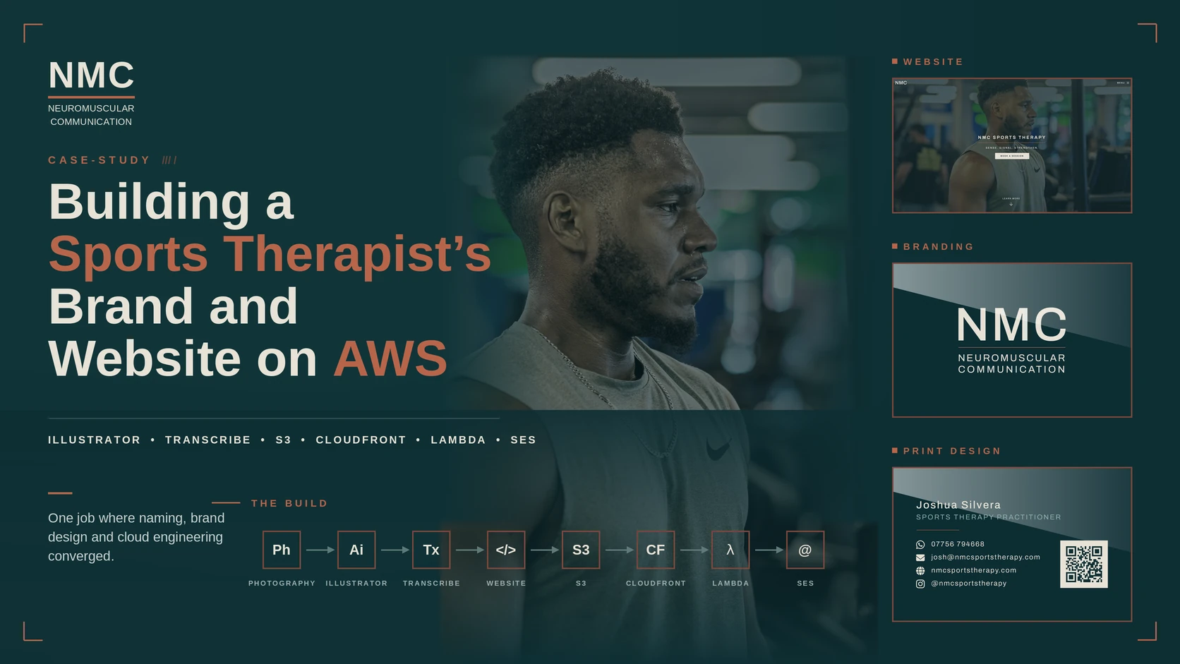
Josh is a sports therapist. He’d already decided what his brand was called, NMC Performance, so I went to buy nmcperformance.com for him. It was taken. So the first job wasn’t building anything, it was finding him a name he could actually have.
The finished site is live at nmcsportstherapy.com.
I did the same job earlier this year for Stephen, a personal trainer at my gym.
Everything below happens in order, and the website is the last thing to exist rather than the first.
graph TD
    subgraph foundation["Foundation"]
        A["Name found,<br/>cleared on two registers"] --> B["AWS account<br/>+ mailbox"]
        B --> C["Social handles<br/>matched"]
    end

    subgraph brand["Brand"]
        D["Colour direction"] --> E["Logo,<br/>avatar + lockup"]
    end

    subgraph site["The Site"]
        F["Repo + brand CSS"] --> G["Built on Spectral"]
        G --> H["Panel talk<br/>turned into a page"]
    end

    subgraph live["Live"]
        I["Deployed<br/>S3 + CloudFront"] --> J["Business card<br/>printed"]
    end

    foundation --> brand --> site --> live

    style A fill:#0E2E33,stroke:#B8654A,color:#E8E2D6
    style B fill:#0E2E33,stroke:#2A7E76,color:#E8E2D6
    style C fill:#0E2E33,stroke:#2A7E76,color:#E8E2D6
    style D fill:#0E2E33,stroke:#B8654A,color:#E8E2D6
    style E fill:#0E2E33,stroke:#B8654A,color:#E8E2D6
    style F fill:#0E2E33,stroke:#2A7E76,color:#E8E2D6
    style G fill:#0E2E33,stroke:#B8654A,color:#E8E2D6
    style H fill:#0E2E33,stroke:#B8654A,color:#E8E2D6
    style I fill:#0E2E33,stroke:#B8654A,color:#E8E2D6
    style J fill:#2A7E76,stroke:#E8E2D6,color:#fff
The Name
The obvious move was his initials, and that’s what I suggested. He wanted NMC instead. I asked what it stood for, and he told me, neuromuscular communication.
Neuromuscular communication
The idea his whole practice runs on. Pain and restriction aren’t always caused by the area where the symptoms show up. They can come from the nervous system, from breathing, from an old injury, from how somebody moves under load, and the job is working out what the body is signalling rather than treating the loudest complaint.
The domain is nmcsportstherapy.com. Long, but it says what he does, and that’s more important than being short.
The Checks
A free domain tells you nothing about whether you’re allowed to use the name.
There are two registers and they don’t talk to each other. Companies House came back clear, and it’s worth running the variants yourself, because it only tests exact matches while the registrar also refuses names that are too like an existing one.
The trademark register took longer, and not because the search was hard. The tool most people land on takes a registration number rather than a word, so typing a name into it returns nothing found, which looks like a clean result and means nothing at all. Run properly, in the class that covers medical and therapy services, eight marks came back. Two are dead, two are a different arrangement of letters belonging to a different business, and one is a hospital using the full three-word phrase. Nobody holds bare NMC. He’s clear to trade.
He isn’t registering a trademark yet, and that’s deliberate. A mark can be revoked if it goes unused for five continuous years, and he has no clients under the name so far. Filing before you trade starts a clock you don’t need running.
One more thing fell out of the search. In UK healthcare, NMC is the Nursing and Midwifery Council. Josh isn’t a nurse and isn’t claiming to be regulated by them, so it isn’t a legal problem. It’s a copywriting rule. The site never says “NMC registered” or anything close to it, and keeping the letters permanently paired with the words drops the ambiguity entirely.
The Account
I set Josh up with his own AWS account and registered the domain inside it, in his name rather than mine.
It’s cleaner that way. His business, his infrastructure, his bill, all of it sitting in one account with his name on it.
I’m not working from his root login. Root is the master key to the whole account and you use it as little as possible, so the first job inside it was creating a separate IAM user for myself, scoped to what the work needs. If those credentials ever leak, the damage stops there.
AWS hides billing from IAM users by default, so while I was still in as root I switched on billing access. Sorted in a couple of minutes.
Route 53 privacy protection is on by default, which is important for a sole trader, because otherwise his home address ends up in a public WHOIS record.
The Mailbox
An email address on the domain has to exist before anything goes to print, because it goes on the card and the Google listing. Zoho’s free tier covers it.
Zoho’s Forever Free plan covers one domain and up to five users at 5 GB each. The catch is no IMAP, POP or ActiveSync on that tier, so it can’t be connected to Apple Mail or Outlook and he uses the Zoho webmail and app instead. Mail Lite at £0.80 per user per month billed annually removes that limit for under £10 a year.
Setup runs in a fixed order and Zoho gates each step, verifying the domain and the first mailbox before the mail records go live. I put the mailbox in Zoho’s EU region rather than the default, so his client data stays in Europe, which is important for a health adjacent practice. SPF and DKIM aren’t optional either. Without both, his mail to gym managers, clubs and prospective clients drops into spam, which defeats the point of having the address.
The address is josh@nmcsportstherapy.com. He’s a sole trader treating individual clients, so people are emailing a person rather than a company. info@ would imply a team that doesn’t exist and read colder on a reply. His full name in front of an already long domain gets unwieldy on a card too, so the personal address won on both counts.
The Social Media
Instagram moved to nmcsportstherapy the same day. The handle, the domain and the email now read identically, and I took the same name on the other platforms even though he doesn’t post there, so nobody else can.
A mismatch between the domain and the handle is the kind of small inconsistency that makes a new brand look temporary.
The Look
The palette gets settled before any design work starts, because it drives the logo, the print work and the site at the same time.
His practice sits between clinical and holistic. He works on fascia, on the nervous system, and he thinks about the whole movement system rather than the site of the symptom. So the palette has to sit in the same place, which rules out most of what the profession defaults to.
| Direction | Colours | Reasoning |
|---|---|---|
| Regulation | Deep teal, teal, bone, copper | Teal reads calm and clinical at once. Copper stops it tipping into hospital |
| Fascia | Near black, slate, pearl, bronze | Taken from the tissue itself. Premium and quiet, needs strong typography |
| Signal | Deep navy, mid blue, off white, sage | Nervous system idea, softened. Easiest to like, most crowded in health branding |
Three things I left out. Red and black is where most sports therapy brands end up, and it signals injury, pain and emergency rather than regulation. Neon green and orange reads as supplements and gym gear. Pastel pink or sage on its own reads as spa massage and undersells the clinical side of what he does.
I showed Josh all three and went with Regulation.
Teal is the only one of the three that reads calm and clinical at the same time, which is the gap his practice sits in. Copper gives a warm accent for buttons, headings and print without touching the base, so it never goes cold. And it’s the most distinctive of the three, because the profession defaults to red and black or to blue and almost nobody in London sports therapy is using teal.
#0E2E33 also does the practical job. It works as a flat single colour mark on white, holds up on a dark site, and converts properly to CMYK for print. Fascia is the better looking palette and the harder one to make work on a phone screen. Signal is the safest and the most forgettable.

The Logo
 The horizontal lockup.
I’d had to ask Josh what NMC stood for, and if I didn’t know after sitting with him on the brand, a stranger scrolling Instagram had no chance. So the words go wherever the mark is seen large, and the letters never appear alone.
The mark is two deliverables, not one, and they never appear together.
The square is the avatar. Instagram, the favicon, the Google profile logo. Those slots crop to a square or a circle and render at about 40px in a feed, so the square carries NMC alone. The words underneath would turn to grey mush at that size, and they’re redundant anyway when the handle and the bio are sitting right next to it.
The horizontal lockup is the actual logo. Site header, email signature, across the front of the card. That’s the one that carries “Neuromuscular Communication”, because it’s the one seen large.
The Type
Archivo, from Google Fonts.
The choice was really about the handover rather than the letterforms. Adobe Fonts webfonts are tied to a Creative Cloud subscription, so using Söhne or Aktiv Grotesk on his site would leave the whole thing depending on my account staying active. A Google Font is free, self-hostable, and goes in his S3 bucket alongside everything else. Nothing about his brand touches my subscriptions.
Archivo also does both jobs. It holds up set large as a monogram and reads properly at 16px for body copy, so the site and the mark stay in one family.
Medium rather than Demi for the wordmark. Three wide capitals set large go blunt at the heavier weight and the counters start closing up. Tracking at 40, which is Illustrator’s thousandths of an em, so about 4 percent.
The Avatar
1000 x 1000 artboard, letters sitting at roughly 65 percent of the width. That feels oversized on a desktop artboard and reads correctly on a phone, which is the only view that counts.
Deep teal ground, bone letters. No rule, no trace, nothing under the letters. At avatar size any of that either disappears or turns into a smudge, and it eats the space that’s currently making the letters read.
The Lockup
A lockup is the mark and the wordmark fixed together as one unit rather than placed separately. Same NMC letters, scaled down, a copper rule beneath them, and “Neuromuscular Communication” split over two lines under that so the block sits inside the width of NMC rather than overhanging it.
Two versions, since it goes on both light and dark grounds. Deep teal on bone, and bone on deep teal, with the copper rule on both.
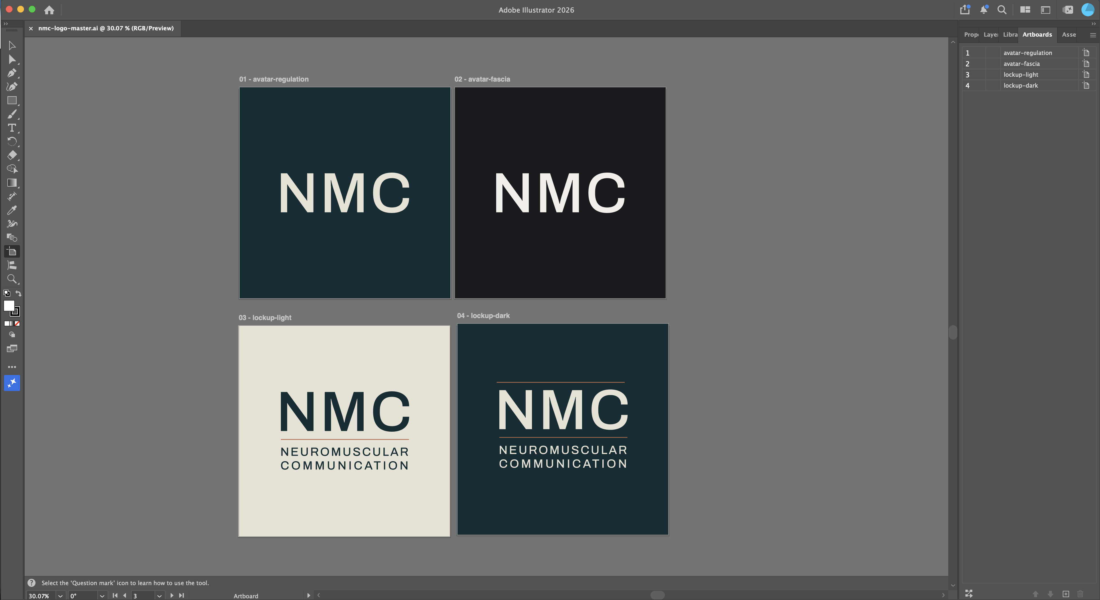
One master file, nmc-logo-master.ai, holding all four artboards so the shapes stay in sync when something changes. Exports at 1000 for social, 512 as the favicon source, a 300ppi copy for print, and SVGs of both lockups for the site.
The Repo
nmc-site, private, on GitHub. GitHub is where the code lives and where every change to it gets tracked, and private means only people I add can see it.
Private because the code is the product now. The layouts, the CSS, the pipeline behind it. That’s the thing I’d be selling as a package to the next client, and every public repo is a fork waiting to happen.
The site is plain HTML, CSS and vanilla JS on an HTML5 UP template. No framework, no build step, no package manager. What’s in the repo is what gets served.
I set the repo up with Claude Code, which is also where the constraints got written down. CLAUDE.md records the stack, the deploy target, the palette and the CSS conventions, so none of it has to be re-explained every session. The four colours sit in assets/css/brand.css as CSS variables, so the site references a name rather than repeating a hex value everywhere. It loads after the template stylesheet, so overrides win without touching the template files.
The Site
The homepage, full screen under a teal tint, with the mark top left.
The Template
Three directions before I picked one.
Spectral is the template, the same one I built Stephen’s site on. Stephen’s runs all black, and I liked it, but Josh needed something different. So this one alternates between deep teal and bone down the page instead, banner, services, about, contact, each section flipping to the next, and that’s what stops the two sites looking like the same template twice.
That’s brand.css doing exactly the job it was set up for. Spectral keeps its structure and its interaction patterns, and every visual decision on top of it gets overridden by a layer loaded afterwards. The template files stay close to stock, which means the next client gets the same base and a different brand layer.
Then the template had to stop being a template. elements.html and README.txt went, both being demo boilerplate. The HTML5 UP attribution came out of the footer, out of main.css, out of noscript.css, out of main.js and out of the Sass sources, because the Spectral licence is bought and paid for. The footer now carries Design by DenMotion as the design credit, quiet at the same muted level as the copyright, lifting on hover.
generic.html stays. It’s the skeleton every interior page gets built from, so it got the brand stylesheet, a tinted title band, a bone reading column and the NMC footer treatment. I nearly deleted it as template debris, which is why it’s now written into CLAUDE.md as deliberate.
The Header
At the top of the homepage the header is transparent over the photograph and carries just the mark, NMC on its own, no words. Two lines of small text over a photo don’t read, so they stay off it.
Scroll and the header turns solid deep teal, and the words fade in beside the mark with the copper rule between them. Nothing jumps around while that happens, the layout holds steady the whole time.
Interior pages have no hero photo, so their header carries the full lockup with the words there from the moment the page loads. The homepage is the only place the letters are ever briefly on their own, and only because there’s a photograph underneath them.
The Photograph
The hero needed a real photograph of Josh, and a photograph under text is a contrast problem before it’s anything else.
Over it sits a deep teal tint, and I built the opacity and the tint colour as controls rather than hardcoding them, so either one can be tweaked to suit whatever photo goes in next without touching the rest of the page.
The Booking
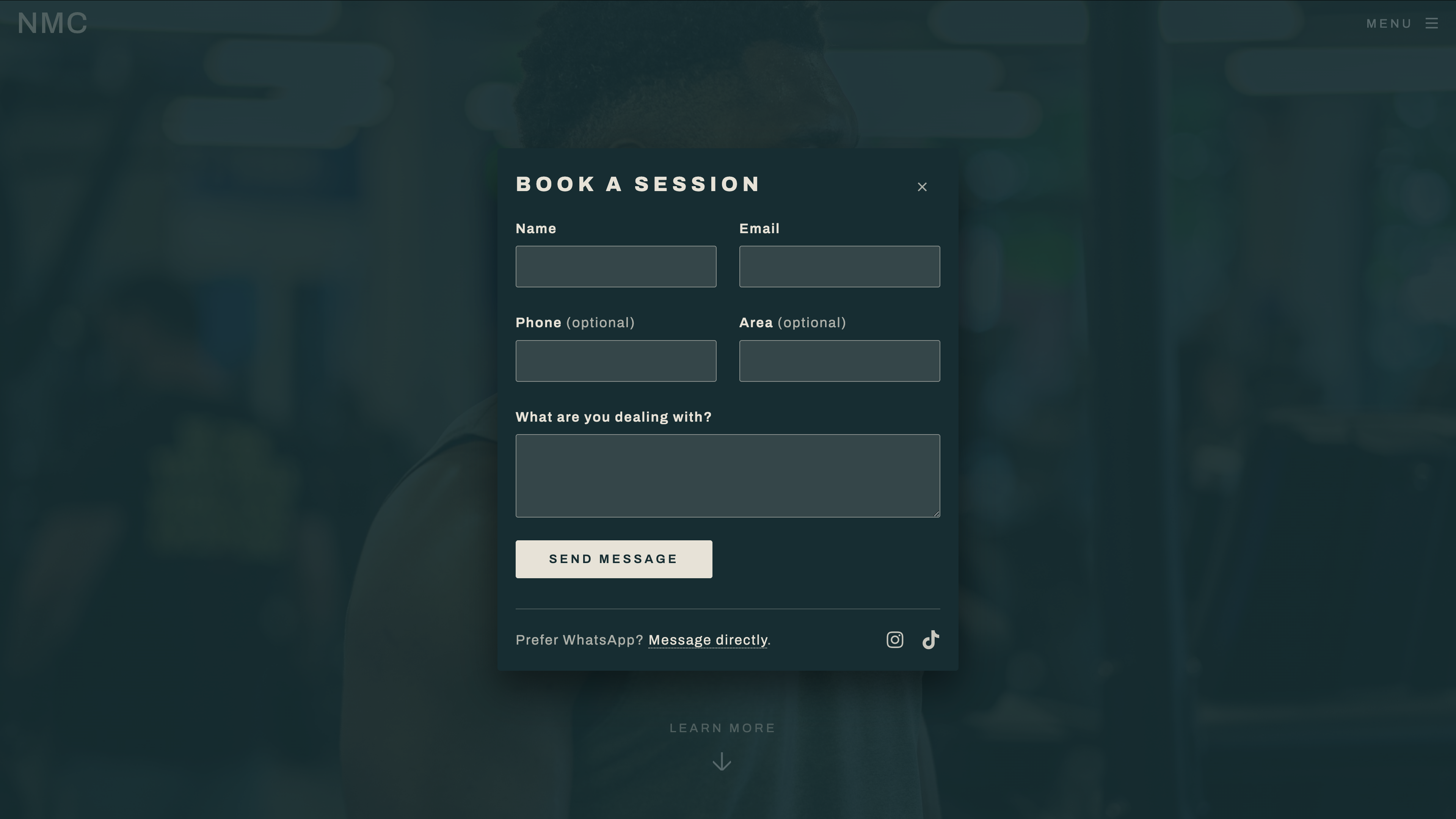
“Book a session” used to drop you at the bottom of the page. Now it opens the form in a popup over the site instead, and closing it doesn’t lose anything already typed.
It still works with JavaScript off, the button just falls back to scrolling down to the same form on the page.
The form takes name, email, phone, area and what he’s dealing with. The backend isn’t built yet, that comes later.
The Fallback
The WhatsApp, Instagram and TikTok links used to disappear once the booking form popped up, so somebody who opened it and didn’t want to fill in a form had no other way to reach him.
They sit inside the popup now, under the form, so the form and the alternative routes stay visible together. WhatsApp stays a worded link rather than an icon, it’s the fastest way to reach him and shouldn’t be something you have to recognise.
The Copy
Spectral comes with every section stuffed with Latin, and a site full of lorem ipsum is a layout rather than a site.
Josh sent over his own founder statement and then talked me through what he actually does in about two minutes, which turned out to be three settings rather than one business.
| Setting | Role | What he does there |
|---|---|---|
| Tramp Health, Mayfair | Main | Recovery Protocol, a 30 minute class, plus sports therapy and sports massage |
| StretchLab | Secondary | Assisted stretching only |
| Private clients | Independent | Sports therapy, EMS, bio fascia scraping |
Cupping runs across all of it except StretchLab. Underneath all three sit the same tools, PNF, soft tissue work, mobility, corrective exercise, strength and conditioning.
The services section leads on the private work, because that’s the thing the site is selling. The class and the stretching studio come after it, and their job is to show that other people already pay him to do this. Six treatment cards further down carry the modalities, and Sense, Signal and Strengthen became the three icons in the philosophy section, which meant unhiding Spectral’s .label spans so the words could actually be read.
Two things the copy is not allowed to say. Nothing anywhere reads “NMC registered” or anything close to it, for the reason set out further up this post. And Josh is currently studying sports therapy, so nothing says qualified, certified or accredited either. Treat, diagnose, cure, patient and rehabilitation all go the same way, because none of them are his to use.
Copy for a practitioner who isn’t regulated is mostly a list of words you can’t have. Write the constraints down before the copy and none of it has to be walked back later.
The Pulse
graph LR
    A["Sense"] --> B["Signal"]
    B --> C["Strengthen"]

    style A fill:#0E2E33,stroke:#B8654A,color:#E8E2D6
    style B fill:#0E2E33,stroke:#B8654A,color:#E8E2D6
    style C fill:#2A7E76,stroke:#E8E2D6,color:#fff
The three philosophy icons sat there doing nothing, so I gave them a slow copper glow that lights each one in turn and settles into a loop.
It only starts once the section scrolls into view, and it drops out completely for anyone with reduced motion set or JavaScript off, they just get the icons sitting still with their copper border and teal wash. There’s a switch in the code to turn the whole thing off too, so the section never depends on the animation to look finished.
Blur that’s wide relative to the shape it sits on will always find the nearest circle.
The Rule
A copper rule is a thin horizontal line, one of the few recurring details across the brand. In the lockup it sits tight under the NMC letters. Around the homepage’s main heading it was doing something different, wide and decorative either side of the text instead. Same colour, same weight, two different jobs.
So the heading version now settles into the same shape as the lockup’s, one copper line sitting directly under the heading, stopping where the type stops. It still draws in from the centre as the page loads, that entrance was good, it just lands in the right place now. It respects reduced motion and works with JavaScript off too, so nobody gets stuck watching a half-drawn line.
The Cards
The service sections used to be a photograph with text sitting underneath, which is what the template does by default. I turned the text panel into a card instead, deep teal lifted slightly toward bone so it stays inside the palette rather than adding a new colour, a thin copper border, and a soft shadow.
The card overlaps onto the photograph rather than sitting beside it, so it reads as resting on the picture itself rather than as a separate block stacked underneath. That’s the same relationship the logo has with the photo behind the header, the brand elements sit on top of the imagery rather than next to it, so the two feel like one thing rather than a photo with a caption bolted on.
The Panel
I had footage of a Women’s Health panel Josh had spoken on, shot on my own Sony A6700. He had no idea any of it would end up on his site.
An hour on a stage, four people talking, and a page that had to be written out of it.
Writing the page from that meant watching an hour of footage back, which costs an hour before you’ve written a word, and whatever you get out of it is still a paraphrase from memory. So the video became text first.
graph TD
    A["Panel video, .MP4"] --> B["ffmpeg -vn<br/>video out, MP3 out"]
    B --> C["S3 + Amazon Transcribe<br/>en-GB"]
    C --> D["transcript.json"]
    D --> E["Women's Health<br/>page copy"]

    style A fill:#0E2E33,stroke:#B8654A,color:#E8E2D6
    style B fill:#0E2E33,stroke:#2A7E76,color:#E8E2D6
    style C fill:#0E2E33,stroke:#B8654A,color:#E8E2D6
    style D fill:#0E2E33,stroke:#B8654A,color:#E8E2D6
    style E fill:#2A7E76,stroke:#E8E2D6,color:#fff
The video itself was never the material. The words in it were, and a video file is the most expensive way there is to store words. So the first move was to throw away the picture and keep the sound. An hour of footage came down to an audio file a fraction of the size, which mattered because the next step was an upload.
From there it went to Amazon Transcribe, the same AWS that runs the rest of the site, pointed at the audio and left to listen. That ran in my own account rather than Josh’s, on purpose. His account holds the domain, the mailbox, the site, the things that are actually his business. The audio and the job that transcribed it are tooling I used to get the words out, not something that belongs to him, so none of it touched his bill.
A few minutes later, plain text of everything said on that stage came back, and that’s what the page was actually written from.
It sat as raw footage on a drive for months before there was a site to write a page for, filmed with no idea it would end up here, and by the time there was, it turned out to be the one page on the site that didn’t need a photoshoot or a founder statement to become copy.
The Second Page
Josh had described the panel to me as women’s health work. Taken at face value that becomes a service on the site, listed next to cupping and EMS, and he starts getting enquiries for something he doesn’t sell. It’s a speaking appearance, not a treatment. So it went on as credibility, on its own page, with the copy saying what it actually was.
That page was built off the same skeleton as the first one, and building it straight away found two things the first page had been hiding. The pull quotes came out in a fake italic, slanted by the browser rather than drawn by the font, because the site only includes one weight of Archivo on purpose. And the footer, which reads fine against the dark band on the homepage, was landing on a bone background against bone text on every interior page. Both were quick fixes once a second page existed to surface them.
A template only proves itself once something else has been built from it.
The Cloud
graph TD
    A["Push to main"] --> B["Site builds"]
    B --> C["S3<br/>private storage"]
    C --> D["CloudFront<br/>HTTPS, worldwide"]
    D --> E["Visitor"]

    F["Contact form"] --> G["Lambda"]
    G --> H["SES"]
    H --> I["Josh's inbox"]

    style A fill:#0E2E33,stroke:#2A7E76,color:#E8E2D6
    style B fill:#0E2E33,stroke:#2A7E76,color:#E8E2D6
    style C fill:#0E2E33,stroke:#B8654A,color:#E8E2D6
    style D fill:#0E2E33,stroke:#B8654A,color:#E8E2D6
    style E fill:#2A7E76,stroke:#E8E2D6,color:#fff
    style F fill:#0E2E33,stroke:#2A7E76,color:#E8E2D6
    style G fill:#0E2E33,stroke:#B8654A,color:#E8E2D6
    style H fill:#0E2E33,stroke:#B8654A,color:#E8E2D6
    style I fill:#2A7E76,stroke:#E8E2D6,color:#fff
The Deploy
nmcsportstherapy.com resolves, and a push to main puts the site on it, all inside his own AWS account rather than mine, the same rule the whole build ran on.
Static files sit in a private S3 bucket, unreachable on its own, with CloudFront in front serving it over HTTPS through an Origin Access Control. The certificate comes from ACM, validated against the domain in Route 53, and CloudFront terminates TLS at the edge rather than the origin ever seeing a plain request. Deploys authenticate through OIDC rather than stored access keys, so there’s nothing sitting in GitHub to leak or rotate. A push syncs the bucket and invalidates the CDN cache, live in about 20 seconds.
Every change to the site is a commit rather than a file upload, so there’s a full history of what changed and when, and any of it can be rolled back to a previous version in seconds if something goes out broken. A typo fix or a new photo is a five minute job end to end, edit, push, live.
The Clean URLs
A clean URL is one without a file extension or a technical leftover on the end, /womens-health rather than /womens-health.html, /services rather than a generic label like /section-two. It reads better, it prints better on a card, and it doesn’t advertise how the site happens to be built.
dailymail.com/home/index.html has bothered me for years, a company that size and their own homepage still carries a filename on the end. I wasn’t doing that here.
Every page on the site is clean this way, and the raw CloudFront domain redirects to the real one rather than quietly serving a second copy of the whole site.
The Form
The form has a backend now.
graph LR
    A["Visitor submits the form"] --> B["API Gateway"]
    B --> C["Lambda"]
    C --> D["SES"]
    D --> E["Josh's inbox"]

    style A fill:#0E2E33,stroke:#2A7E76,color:#E8E2D6
    style B fill:#0E2E33,stroke:#B8654A,color:#E8E2D6
    style C fill:#0E2E33,stroke:#B8654A,color:#E8E2D6
    style D fill:#0E2E33,stroke:#B8654A,color:#E8E2D6
    style E fill:#2A7E76,stroke:#E8E2D6,color:#fff
Setting it up meant wiring API Gateway to accept the form’s submission, writing a small Lambda function to handle it, and verifying the domain in SES so AWS would actually let it send mail on Josh’s behalf.
No server sits running between enquiries costing money, and no third-party domain is involved anywhere in the page. Replies go straight back to whoever sent the message, so Josh just hits reply in his normal inbox and it lands in the right place.
It works even with JavaScript switched off, the form still submits and still reaches him. JavaScript only upgrades the experience so the booking popup can confirm it went through without leaving the page.
The Card
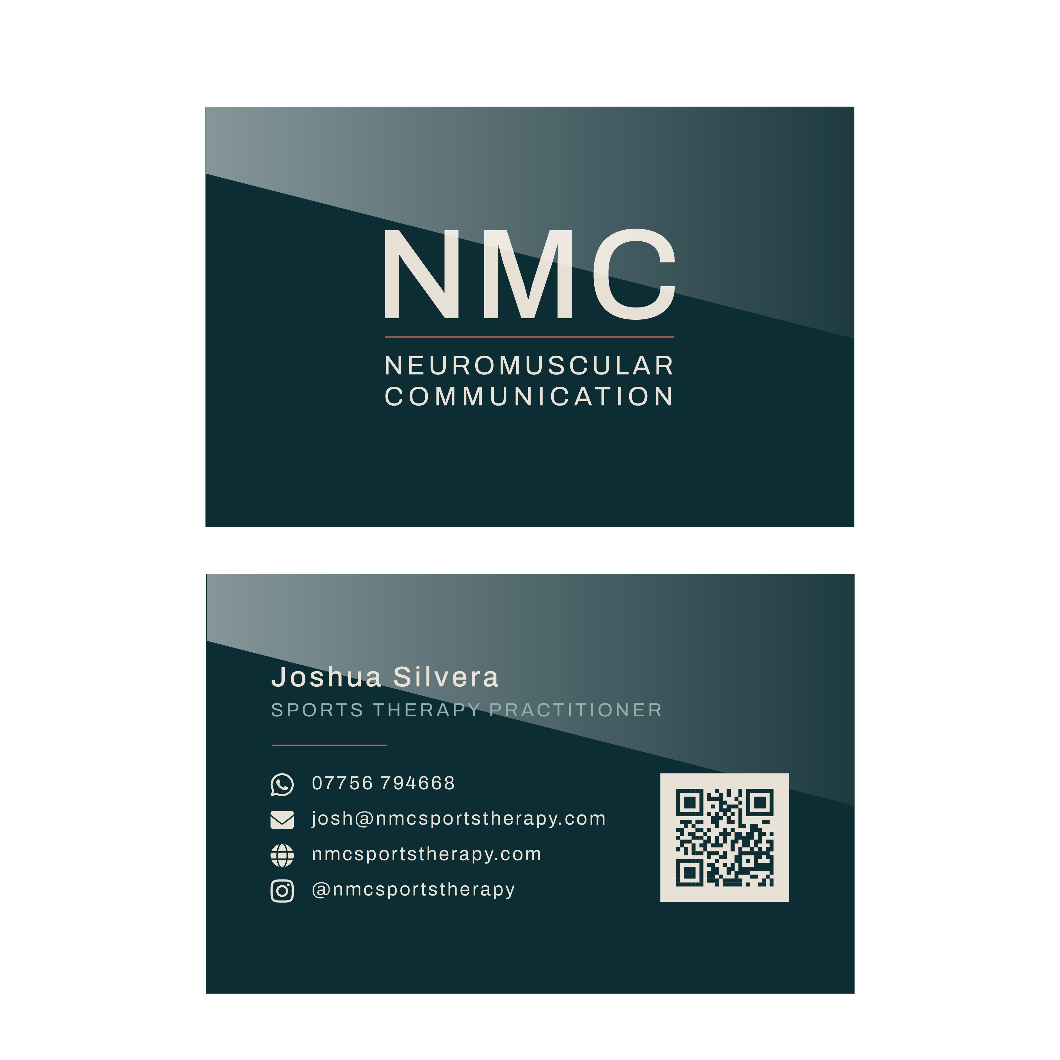 Front carries the mark. Back carries his details and a QR code to the site.
The front places the master logo file straight into the artboard rather than retyping the letters, so it’s exactly the same mark as everywhere else. The back carries his name, role, contact details and the QR code, all in the same teal and copper.
The QR code was the satisfying bit. Most free generators hand you a code that redirects through their own domain, so if they ever fold or start charging, every printed card in circulation goes dead. I made it in the terminal instead.
1
qrencode -t SVG -o nmc-qr.svg -l Q -m 4 'HTTPS://NMCSPORTSTHERAPY.COM'
That’s a static code with the address encoded directly inside it. Free, nothing to expire, and it’ll still work in ten years.
Then the export, at proper print spec.
| Setting | Value |
|---|---|
| Standard | PDF/X-4 |
| Colour conversion | Convert to Destination |
| Destination profile | Coated FOGRA39 |
| Bleed | 3mm on all four edges |
| Trim marks | On, 3mm offset |
| Colour images | 300ppi, bicubic downsample |
| Fonts | Outlined before export |
Before it went to print I checked the file rather than trusted it, the trim and bleed measurements actually in there, no fonts embedded so the type really is outlined, and the ink coverage under the ceiling for the paper.
A print PDF is the one deliverable that can’t be corrected once it’s at the printer, and it’s also the one that can be measured completely before it gets there.
The Tally
Naming, ownership, legal checks, DNS, the mark, and a live site.
| Piece | Where it lives | Owner |
|---|---|---|
| Domain | Route 53 | Josh |
| DNS | Route 53 hosted zone | Josh |
| Mailbox | Zoho, EU data centre | Josh |
| Social media handles | Instagram and others | Josh |
| Name clearance | Companies House, UK IPO | n/a |
| Colour direction | Regulation, teal and copper | Josh |
| Logo, avatar and lockup | nmc-logo-master.ai | Josh |
| Site repo | Private GitHub repo | Me |
| Brand CSS | assets/css/brand.css | Josh |
| Template licence | Spectral, commercial | Josh |
| Webfont | archivo-latin-var.woff2, self-hosted | Josh |
| Photographs | Four, optimised WebP, metadata stripped | Josh |
| Site copy | index.html and womens-health.html | Josh |
| Hosting | nmcsportstherapy-site, S3 and CloudFront | Josh |
| Deploy role | nmc-site-github-deploy, OIDC, no stored keys | Josh |
| Contact backend | API Gateway, Lambda and SES | Josh |
| Business card | Print-ready PDF/X-4, both sides | Josh |
Every line in that owner column says Josh. He owns the brand rather than borrowing it from me.
- Name chosen and the letters explained rather than discarded
- Domain bought in his own account
- Cleared on Companies House and the trademark register
- Email live on the domain with SPF and DKIM
- Social media handles matched to the domain
- Colour direction chosen
- Avatar and lockup drawn and exported
- Repo and brand tokens set up
- Template direction settled, two builds thrown away to get there
- Site built on Spectral with the brand layer over it
- Archivo self-hosted, no third-party requests
- Favicon, Apple touch icon and OG image cut from the avatar
- Contact form and booking dialog, no-JS fallback intact
- Hero photograph optimised and tinted to a measured contrast floor
- Four photographs converted, stripped and placed, no template stock left
- Hero export rule written down so a swap needs no CSS change
- Every section filled with real copy, no Latin anywhere
- Footer icon labels reachable by a screen reader
- Panel footage transcribed through ffmpeg, S3 and Amazon Transcribe
- Women’s Health panel page built off the skeleton
- Section reveal on scroll, and a signal pulse behind a switch
- Hero rules resolved to one, matching the lockup
- Service panels rebuilt as elevated cards overlapping their photographs
- Booking dialog carries a working contact route, not just a dead form
- Design signed off, everything committed and pushed
- Live on the domain over HTTPS, deploying on a push to
main - Real 404 page, extensionless URLs, named section anchors
- Contact form sending through API Gateway, Lambda and SES
- Business card built and exported print-ready, verified against the file
- Handed over in person, everything running on his own accounts
The Handover
Josh came over and I showed him the lot.
The site on its own domain, the contact form sending an enquiry into his Zoho inbox while he watched, the card, the mark, where everything lives. He loved it. That’s the handover, and for this client it’s the right one, he’s a friend I see anyway, and a document he’d never open is worse than a conversation he was in the room for.
Everything runs on his accounts, the domain, the DNS, the mailbox, the bucket, the distribution, the deploy role, the Lambda. The repo stays with me, since the deployed site lives entirely in his own S3 bucket and nothing he needs sits behind my GitHub account.
Two things went to him rather than getting done for him. The Google Business Profile is his to set up, since the listing wants verifying by the person who owns the business. And the poster got dropped, a mobile therapist with no premises has nowhere to put one.
So the final tally. A name found after the obvious one was gone, a domain and an AWS account in his name, two registers cleared, a mailbox with SPF and DKIM, a colour direction, a mark in two forms, a site reshaped from a template until it stopped looking like one, a panel talk turned into a page, a live deploy on a push, a working contact form, and a print-ready card. All of it on his accounts, all of it carrying the same teal and copper.