Making the DenMotion logo
A wordmark, a monogram, and the favicon, link preview and email signature that came out of them.
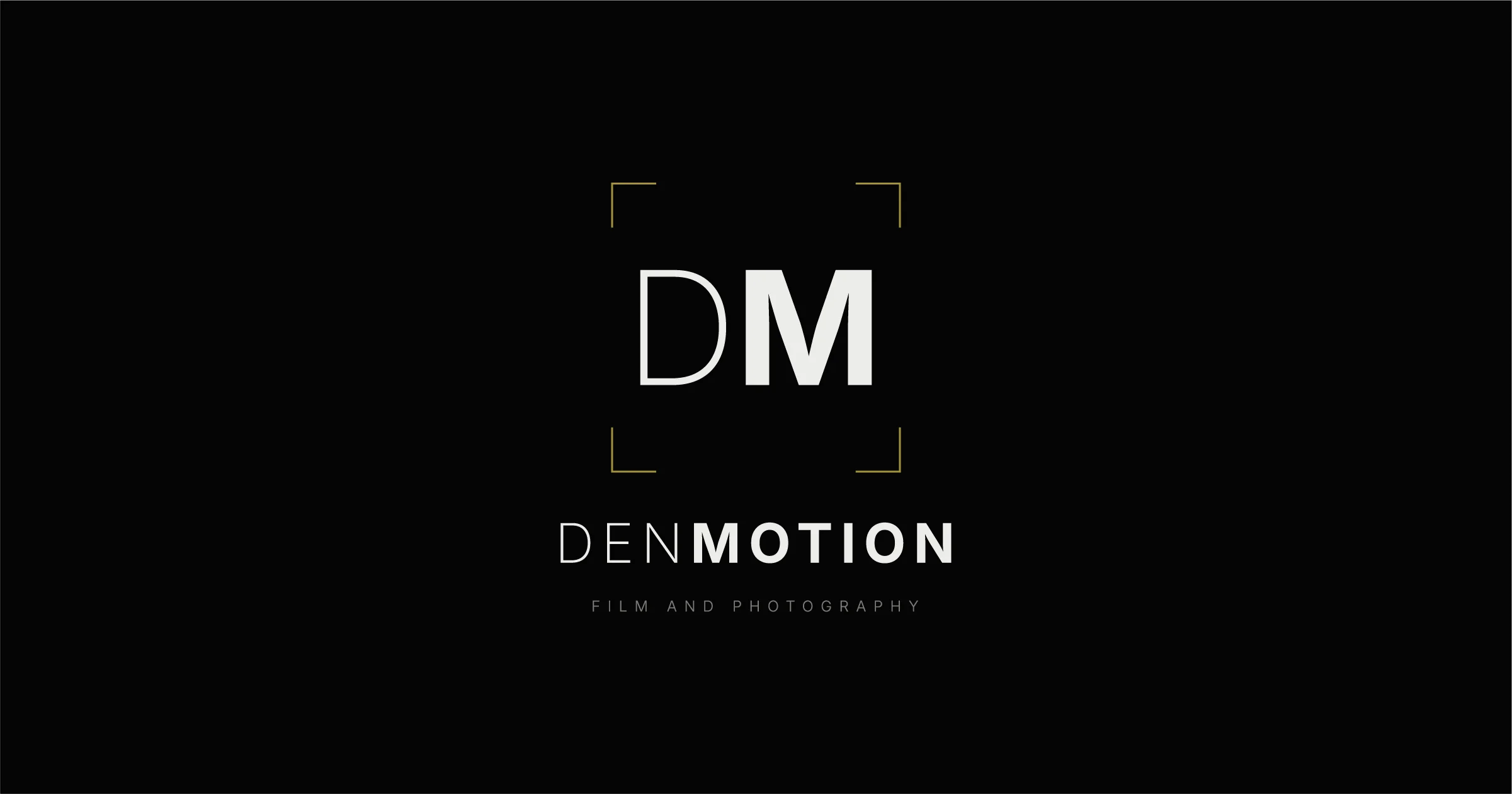
The DenMotion logo is a wordmark. That means the logo is the name itself, set in a particular typeface, rather than a symbol standing in for it. Google, Sony and FedEx all work the same way.
It’s the name as one word with no space in it. DEN is light and MOTION is bold, both at the same size and in the same colour, so the change in weight is the only thing marking where one half ends and the other begins.
Until now it only existed as a line of text on a web page. The browser draws it from a stylesheet every time the page loads, so there was no picture of it anywhere, nothing to open in Illustrator and nothing to hand to anything that wants an image.
Plenty of things want an image. A favicon is the small square icon sitting in a browser tab next to the page title, and it needs a version that holds together at 16 pixels. The preview that shows when someone pastes your link into WhatsApp needs a fixed canvas. An email signature needs something that works on a white background and a dark one.
So I built the set properly in Illustrator using one document with seven artboards, and every asset the site uses comes out of it.
This is the first of three. The business card takes the same marks into ink, and the inbox puts a working mailbox behind the address printed on the back of it.
- A monogram that reads at 16 pixels
- The same monogram inside the corner brackets, for home screen icons
- The full lockup, wordmark above tagline
- A link preview image on a fixed 1200 by 630 canvas
- An email signature tile that holds up on white and on dark
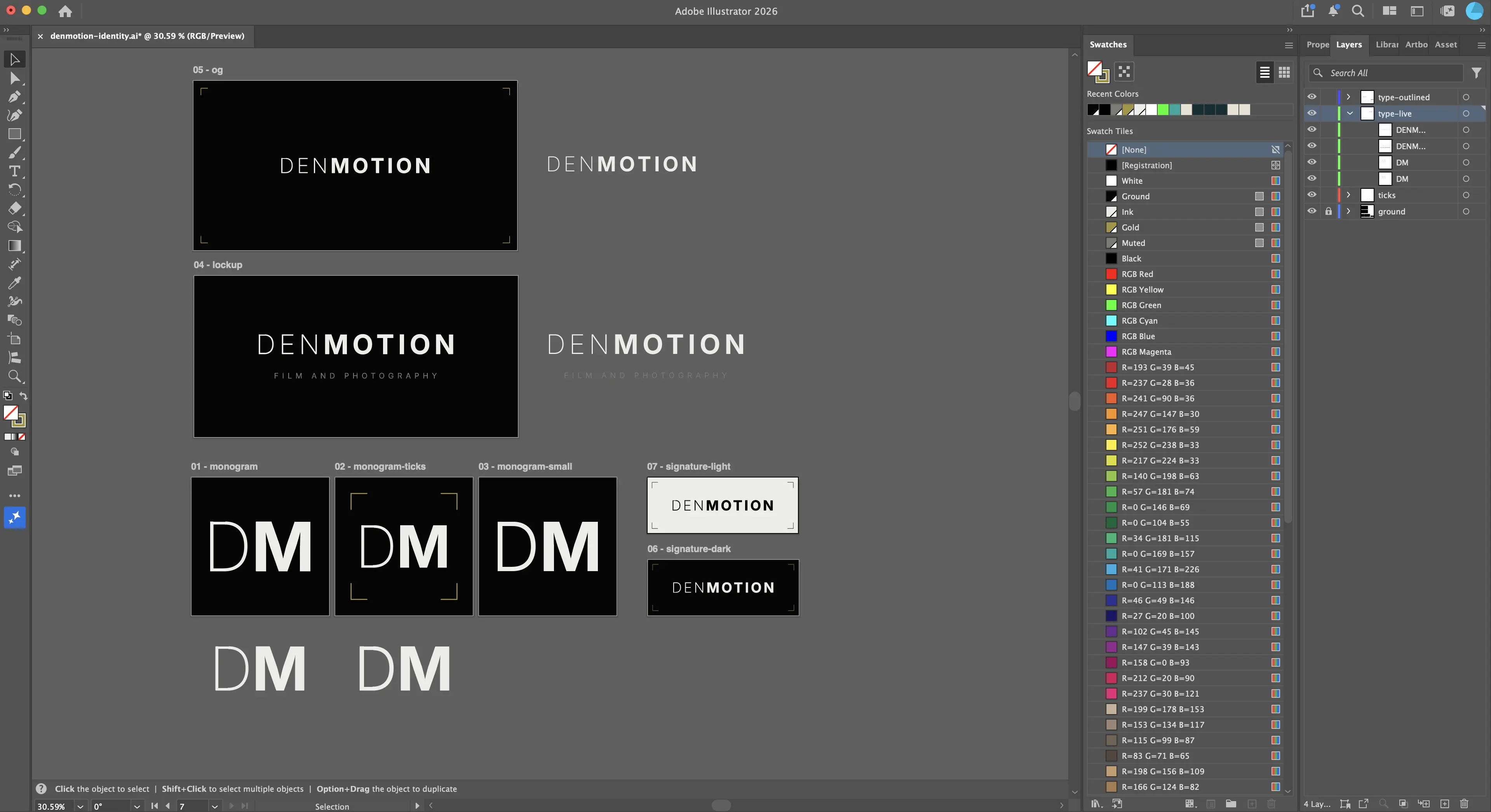 Seven artboards in one file. Three icon squares at 512 pixels, the lockup, the link preview image, and two email signature tiles.
The monogram
DENMOTION is nine letters. At the size of a browser tab that’s about two pixels each, so the wordmark was never going to be the favicon. It had to compress.
So I cut it down to DM and kept the same trick. The D is light and the M is bold, with no space between them. The D stem is roughly half the width of the M stem.
One thing changes from the wordmark. On nine letters the wide letter-spacing is character. On two letters it just prises them apart into separate initials, so the monogram runs tight instead.
Then I made a version inside the corner brackets, which are the viewfinder motif running through the rest of the identity. They work here because a monogram is a single object. Repeated across a grid of photos the same motif turns into noise, which is why they don’t appear there.
The brackets are heavier here than anywhere else the motif appears. Scaling a hairline down proportionally gives about half a pixel, which vanishes the moment anything turns it into an image. So the motif gets thicker as the canvas gets smaller, which is the opposite of how scaling artwork usually goes.
The third version is almost identical to the first, with the D a notch heavier. At 16 pixels the light stem falls under a single pixel wide and the letter starts to look damaged rather than light. That one is what actually renders in your tab.
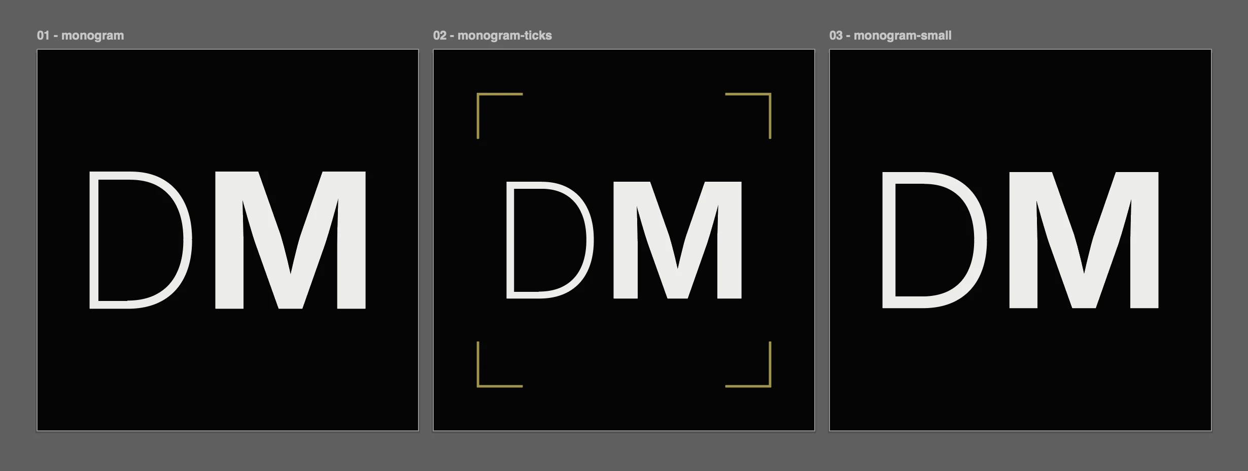 All three sit at 512 pixels square. The ticked version drops the mark to 315 pixels to make room for the brackets, which sit 56 pixels in to clear the rounded corners iOS forces on home screen icons. On the right the
 D runs one weight heavier, which is close to invisible at this size.
The lockup
The full lockup is the wordmark with FILM AND PHOTOGRAPHY sitting under it.
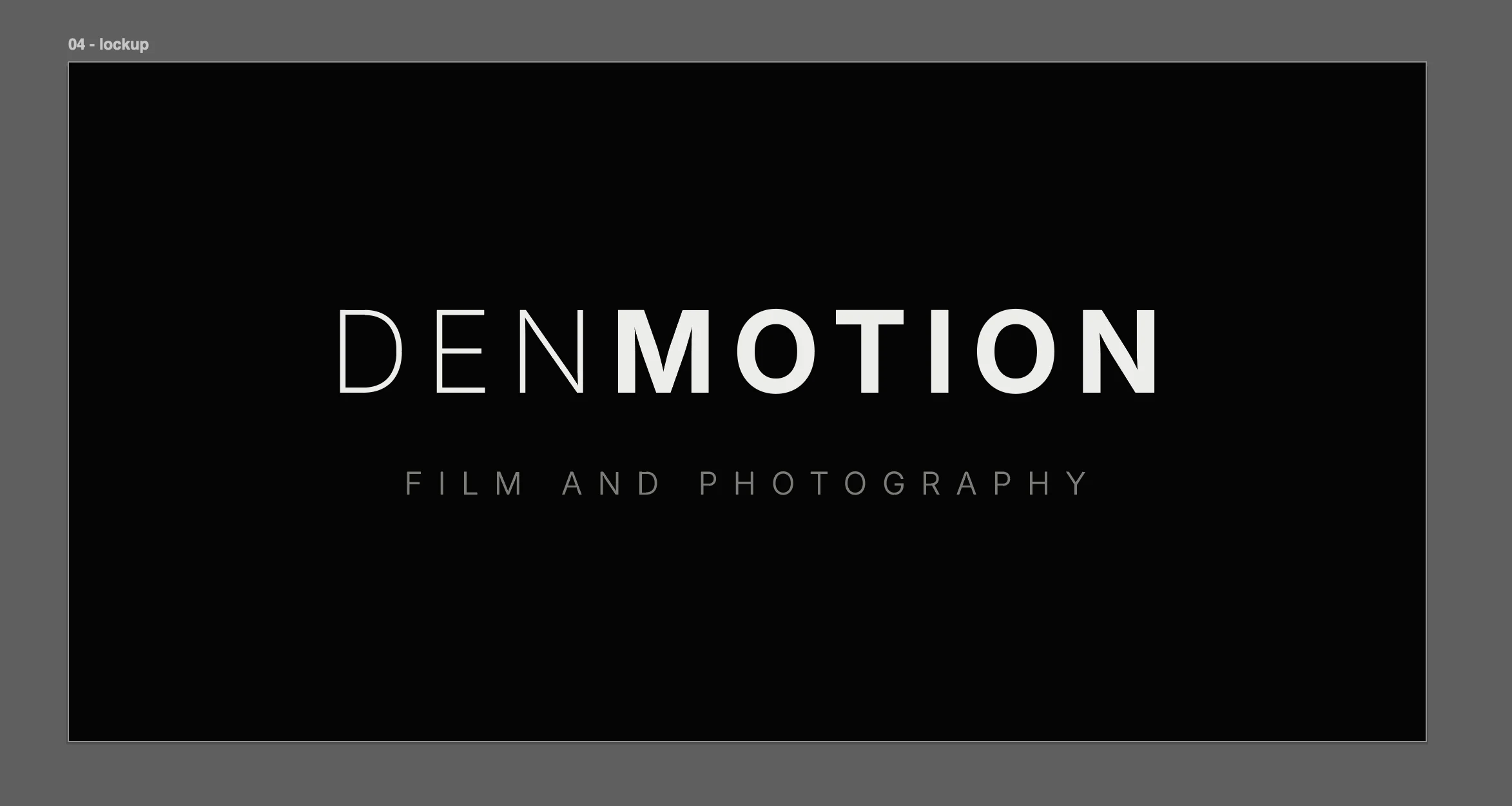 Wordmark at 100 pt and tagline at 27.5 pt, with no line between them because the space does that job.
Everything here is a ratio rather than a measurement. The tagline is 27.5 percent of the wordmark size, and it sits 0.90 of the wordmark size below it. Change the wordmark size and the rest follows.
That 0.90 puts the gap at roughly the height of a capital letter in the wordmark, which is the same clearance I keep around the outside of the lockup, a number with a reason behind it rather than one that looked about right.
There’s a correction hiding in every centred line of this identity. Letter-spacing adds space after every character including the last one, so a spaced-out line carries an invisible gap on its right and sits fractionally left of true centre. The fix is to select the final letter on its own and take its spacing back to zero. It’s small on the wordmark and very visible on the tagline, which is spaced three times as wide.
The preview image
This is the one that shows when someone shares a link, and it runs on a fixed canvas of 1200 by 630.
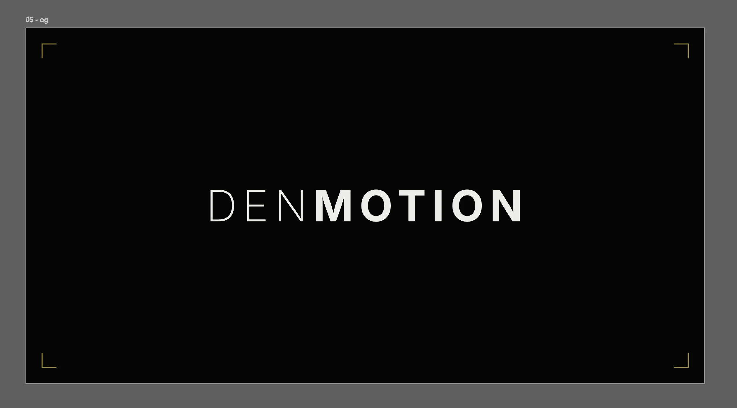 Wordmark and four corner ticks, with no tagline and no web address.
It started with more in it and got stripped back. The reason is the crop. On mobile most apps show a compact card that takes roughly a square out of the middle, which is 630 pixels of a 1200 pixel canvas. The wordmark at full size spans 710, so the D and the last N were falling off the edges.
At 76 point it spans 560 and sits inside the crop with room either side. Dropping the tagline and the web address let the wordmark own the frame, which reads much larger than three things sharing it.
The signature
The signature is a dark tile carrying the wordmark, with everything else left as ordinary text.
 The same file in both modes. Only the tile is an image.
The tile is dark on purpose. An image with a transparent background disappears against a white email, and if you invert it to dark letters it disappears against a dark one. A solid tile carries its own background, so it can’t fail either way.
Name, tagline and contact details stay as live text underneath. They stay selectable, they scale with whatever the reader’s settings are, and the tagline avoids being baked in at about five pixels tall.
There’s a light version of the tile too, colours swapped, made for the business card rather than for email.
The output
Seven artboards go out as vector files, then get rendered to the exact pixel sizes each one needs.
Exporting one big image and shrinking it to the smaller sizes is quicker, and it produces a slightly blurred version of every small icon. A one-pixel stem gets smeared across two at half strength. Rendering each size from the vector keeps it sharp.
Six files live on the site. A favicon in two formats, three app icons for home screens, and the link preview image. Two more sit outside the repo for email. One artboard exports nothing at all, held back as the clean monogram for print work where the bracket frame won’t suit.
The vector masters are versioned alongside the site, so the entire set rebuilds from source. Largest file is 4.9 KB.