Making the DenMotion business card
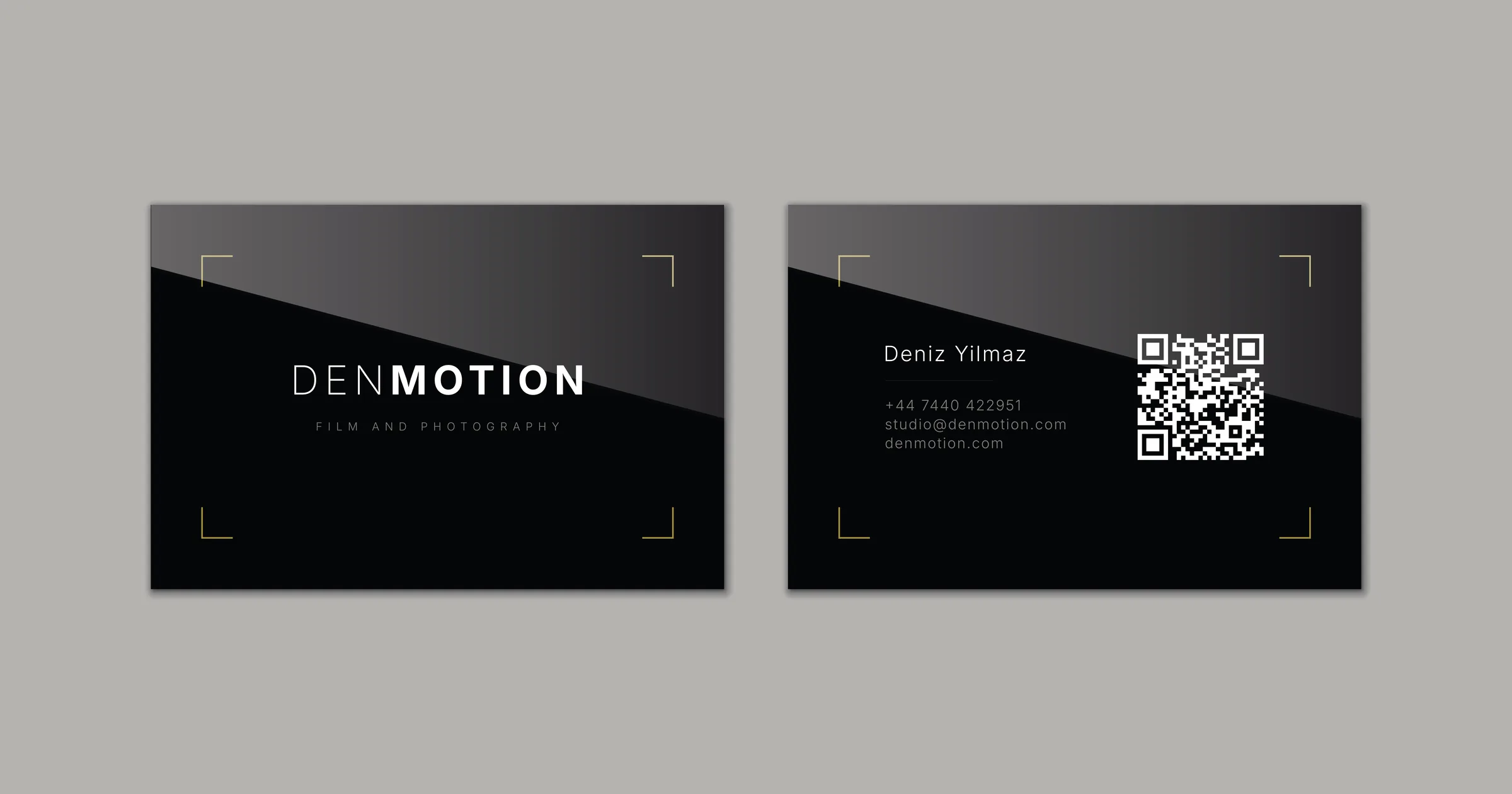
An 85 by 55mm CMYK document, a four-colour black built by hand, a wordmark knocked out of the ink, gold foil corner brackets, and five press-ready PDFs.
The logo set went out two days ago, seven artboards producing a favicon, a link preview image and an email signature tile. One artboard in that file exported nothing at all, held back as a clean monogram for print work.
This is the print work.
A logo file and a business card are not the same job. The logo set renders on screens, where colour is light coming out of a display. A card is ink sitting on paper, and paper doesn’t emit anything.
So this one starts in a new Illustrator document rather than the identity file. Print means CMYK instead of RGB, it means bleed, and it means a black that has to be specified rather than converted.
This is the middle of three. The inbox comes after it and turns the address printed on the back into a mailbox that actually receives.
- A print document at 85 by 55mm with 3mm bleed on every edge
- A black built for ink rather than sampled from a screen
- A front carrying the wordmark
- A back carrying the details and a QR code
- Five press-ready PDFs, print and foil supplied separately
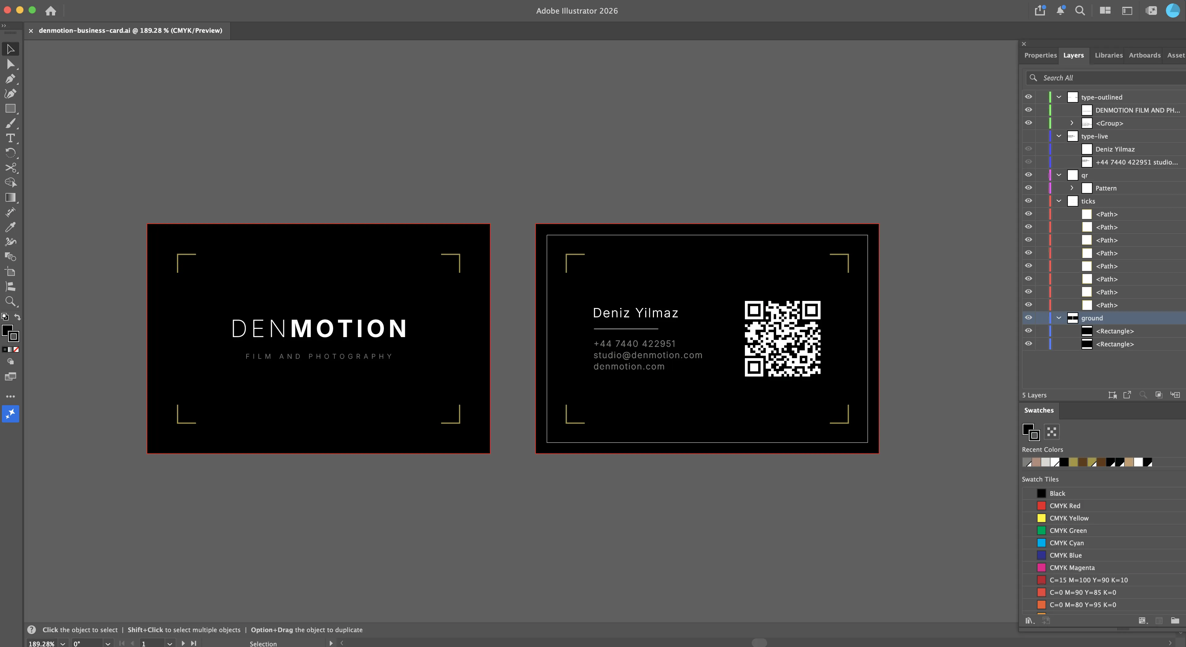 Both artboards are 85 by 55mm. The red line running outside each one is the 3mm bleed, and the ground rectangles are 91 by 61 so they run past it.
The bleed
Printers cut with a tolerance of about a millimetre. A background that stops exactly at the edge of the card gives you thin white slivers along one side when the blade lands slightly off.
So the black runs past the trim line by 3mm on all four sides and gets cut off. The rectangle is 91 by 61 on an 85 by 55 card, and the extra 6mm exists only to be thrown away.
Everything that isn’t meant to be cut has to stay well inside instead. The same rule sets the clearances on the back.
The black
The card is mostly black, so the black had to be right.
On the site it’s #050505, a hex code, which is a colour written for a screen to light up. Ink doesn’t light up. It sits on paper, so the card needs its own black mixed from the four inks a press carries, cyan, magenta, yellow and black.
There are two obvious options and both are bad. Letting Illustrator convert the hex hands back C75 M68 Y67 K90, percentages of each ink, adding up to 300 percent landing on one spot. That much wet ink dries slowly and offsets onto the next sheet in the stack, and with all four running heavy, one ink a fraction out of line leaves a coloured fringe on the thinnest thing on the card, the light half of the wordmark. Go the other way and print black on its own at 100 percent, and across an area this size it comes out a flat washed-out grey.
So the card uses a mix.
| C | M | Y | K |
|---|---|---|---|
| 40 | 30 | 30 | 100 |
Black at full strength does the work and the three colours underneath it kill the grey. It comes to 200 percent, well under what any press will take.
The knockout
The off-white in the wordmark is stranger than the black. Its swatch is zero percent of everything.
That isn’t a colour. It’s an instruction to lay down no ink at all, so the shape of the letters is a hole in the black and what you read is the paper underneath. Reversed type on a dark card stays sharp for exactly this reason, because there’s no second plate that could shift against the first.
The consequence is that #EDEDEA stops being a value I control. It becomes whatever the stock is. On a bright coated card that’s cooler than the screen version, and on a warm uncoated stock it lands close to the off-white by accident.
The front
The front carries the wordmark, the tagline and four corner brackets, with nothing else on it.
The brackets are the same motif as the icons and they follow the same rule, which is that the stroke doesn’t scale with the artwork. On a 512 pixel icon they run 3pt. Here they’re 1pt on 5mm arms, and they’re the one thing on the card that isn’t printed.
They’re gold foil instead, which is metal film rather than ink. The ticks were already the only accent in the identity, so making them the only special finish keeps one thing special rather than two competing.
Foil changed one thing about them, which is the stroke weight. At 0.75pt the ticks were fine as ink and too fine for foil, which fills in or lifts unevenly below about 1pt. So they thickened. Stroke grows outward from the centre of the path, so nothing needed re-aligning, and the arms are 0.09mm wider on each side.
The tagline sits at 5pt. That’s the ratio doing its job, 27.5 percent of the wordmark size, and it’s also close to the floor for print. It’s set light and small, and printed grey rather than knocked out of the black. On a digital press it holds. On offset it’s the first thing that would fill in, which is a question for whoever prints it rather than something I can settle in the file.
 The wordmark is 18pt with the same 150 tracking as everywhere else, and the final letter is set back to zero so the line centres properly.
The back
The back carries my name with a hairline rule under it, three lines of contact details below that, and a QR code sitting beside them.
Two things nearly went on this side and didn’t. The monogram came off because the front already says the name, which made it decoration. The red record tally came off because it would have completed the viewfinder reference while reporting nothing.
The tagline came off too. It’s on the front, and the same six words twice on an 85mm card works against the restraint the rest of the identity runs on.
The clearances came last. The bracket arms run from 5 to 10mm on the left and 75 to 80mm on the right, so anything starting inside 10mm or ending past 75mm sits in the bracket zone and reads as crowded without touching anything. The text block starts at 12.5mm and the code runs from 52.5 to 72.5mm, which gives 2.5mm on each side and closes the gap in the middle at the same time.
 The name is 9.5pt, the rule is 17mm long and a quarter of a point thick, and the contact lines are 6.5pt. The gaps above and below the rule are equal at 3mm, so it reads as a divider rather than an underline.
The code
Generated from the terminal rather than a website, because a QR code is just an encoding of a string and there’s no reason to hand that to a third party.
1
qrencode -o denmotion-qr.svg -t SVG -l H -m 0 "https://denmotion.com"
Error correction level H tolerates the most damage, which is what a code living in a wallet needs. The -m 0 strips the margin so the code’s own quiet zone can be set in the layout instead.
It’s inverted on the card, light modules on black, which most modern phones read without complaint and some older scanners can’t. So it got tested on a phone before anything went near a printer.
The vector arrives with a white background rectangle behind the modules, which takes the fill along with everything else and turns the whole code into a solid square. Ungroup, delete the rectangle, then recolour what’s left.
Size is 20mm square. That’s the floor for a phone to read it at arm’s length, which is exactly the distance someone holds a card.
The printer
The printer is Aura Print, whose configurator reprices the whole order every time an option changes. That turns each choice on the card into a number rather than a preference, and every figure below is 250 copies with everything else held the same.
This much is settled whichever way the rest goes.
| Size | 85 x 55mm landscape, double sided |
| Stock | Silk |
| Full colour, both sides | |
| Lamination | Soft touch, both sides |
| Corners | Square |
| Quantity | 250, one design |
| Proof | Digital, before print |
The stock is settled too. The weight, the edges and the foil are the three still open, and the three that move the price.
The stock
Silk is a coated paper. The surface is sealed, so ink sits on top of it rather than soaking in, and everything prints the size it was drawn.
That’s what this card needs. The tagline is 5pt and the rule under my name is a quarter of a point, both small enough that any spread would show. The foil ticks are 1pt and need a smooth surface to bond to cleanly. A sealed surface also holds a denser black, on a card that’s black nearly edge to edge.
Silk is the base soft touch lamination goes onto as well, which is where the finish in the hand comes from.
The weight
400gsm, which is grams per square metre, the number that reads as thickness in the hand. Office paper is 80 and the base option on this job is 350.
| Silk, no foil | |
|---|---|
| 350gsm | £47.95 |
| 400gsm | £47.95 |
| 700gsm | £72.95 |
350 and 400 are the same money. 700 is £25 on top, which is 10p a card for roughly double the thickness.
What changes with the weight is the cut edge. Card stock is white in the middle whatever is printed on the outside, so the trimmed edge shows a white line, and twice the thickness shows twice as much of it on a card that’s black everywhere else.
The edges
Painted edges cover that line. Paint is sprayed onto the cut face of the stack after trimming, so in black the card comes out black on every surface including the four it gets cut on.
| 700gsm silk, no foil | |
|---|---|
| Plain edge | £72.95 |
| Black painted edge | £137.95 |
£65 for the edges, which almost doubles the price of the stock underneath them. They need the thickness to have an edge deep enough to take paint, so the two go together.
The foil
Foil isn’t ink. The press lays down toner where the artwork goes, then heat and pressure push a roll of thin metallic film against it. The film bonds to the toner and lifts away everywhere else, so what ends up on the card is a layer of metal sitting on the surface.
That’s the whole reason for using it. Ink can only ever be one colour, and printed gold is a flat brownish yellow that stays flat brownish yellow. Metal reflects, so the ticks are dark when the card lies still and bright when it tilts, and they change while the person holding it moves.
| 400gsm silk | |
|---|---|
| No foil | £47.95 |
| Gold foil, both sides | £129.95 |
£82 for the foil, close to two thirds of the total and 33p a card for four brackets a side. On the 700 the same option is £81, so it’s priced by the side rather than by the stock it lands on or the area it covers. Four hairline brackets and a card covered in gold cost the same.
It’s also the only element on the card that isn’t printed, the only one that changes as the card moves, and the only accent the identity carries anywhere else.
| Silk, gold foil both sides | ||
|---|---|---|
| 400gsm | £129.95 | 52p a card |
| 700gsm | £153.95 | 62p a card |
| 700gsm, black painted edges | £218.95 | 88p a card |
The output
Foil is applied after printing rather than at the same time, so the two have to be supplied separately. Aura want five files.
| File | Contents |
|---|---|
Front_Print | Everything except the ticks |
Back_Print | Everything except the ticks |
Front_Foil | The four ticks in 100% K on white, nothing else |
Back_Foil | The four ticks in 100% K on white, nothing else |
Composite | Both sides as they should finally look, reference only |
The foil files being black is the part that reads as wrong the first time. Black isn’t a colour there, it’s a position. It tells the press where to lay the toner that the foil bonds to, and the foil itself is whichever colour was ordered.
The print underneath carries on where the foil lands. Foil is opaque so nothing beneath it shows, and leaving the print running underneath means a millimetre of movement during production doesn’t expose an edge.
Export settings for all five, identical so print and foil register against each other.
| Setting | Value |
|---|---|
| Preset | PDF/X-4:2008 |
| Colour conversion | No Conversion |
| Output intent | Coated FOGRA39 |
| Bleed | Use document bleed |
| Trim marks | Off |
No Conversion is the line that protects the black. Convert to Destination re-separates it, which undoes the whole point of building it by hand.
The output intent is per document rather than per file, and it defaults to a US profile. The foil document is a separate file, so it needs setting there too, which is easy to miss.
A preview shows none of that, so the five files get read rather than looked at.
- Every ink value under the press limit
- No foil colour in the print files, nothing but 100% K in the foil files
- All pages the same size with the same trim box
- Fonts either all outlined or all embedded
- The output intent matching the stock
The artwork is finished. The last thing left is what it gets printed on.
The decision
The 700 on its own is the one build that doesn’t make sense. It costs £25 more than the 400 and shows twice as much white along the cut edge, so it buys a worse version of the problem it was meant to improve. Either the painted edges come with it or the weight isn’t doing anything.
That makes it a choice between two cards rather than four. The 400 with foil on both sides at £129.95, or the full 700 with black edges at £218.95, which is 52p a card against 88p.
I’m going with the 400. Nothing about this card has existed outside a screen yet. The black is a build I worked out on paper and have never seen come off a press, the foil is a finish I’ve only read about, and soft touch is something you have to hold before you know whether it was the right call. Spending £89 more on three finishes I can’t judge, across 250 cards, is finding that out expensively rather than cheaply.
The foil stays either way. It’s £82 of a £129.95 order and the single most expensive decision on the card, and it’s also the only part that isn’t the same every time you look at it. Cutting it would save more than everything else put together and leave a black card with grey text on it.
If the proof comes back with the black deep and the ticks catching the light the way they should, the 700 with black edges is the version to order next, on a much smaller run so the expensive one goes to the handful of people it would actually land on.
The whole card comes out of one Illustrator document with two artboards on it, four swatches, and five PDFs that go to the printer. The smallest thing on it is a quarter of a point and the largest is a hole in the ink, and the brackets sitting in its four corners never get printed at all.
That’s the whole chain, from the two files it started as through to the box that arrives.
graph TD
    A["Identity file<br/>7 artboards, RGB"] --> C
    B["qrencode<br/>SVG, level H"] --> C
    C["Card document<br/>2 artboards, CMYK"] --> D["Front artboard"]
    C --> E["Back artboard"]
    C --> J["Composite<br/>reference only"]
    D --> F["Front_Print"]
    D --> G["Front_Foil"]
    E --> H["Back_Print"]
    E --> I["Back_Foil"]
    F --> K["Print pass"]
    H --> K
    K --> M["Foil pass"]
    G --> M
    I --> M
    M --> L["250 cards, £129.95<br/>400gsm silk, soft touch<br/>gold foil, no painted edges"]

    style A fill:#1a1a2e,stroke:#a39339,color:#fff
    style B fill:#1a1a2e,stroke:#a39339,color:#fff
    style C fill:#0f3460,stroke:#a39339,color:#fff
    style D fill:#16213e,stroke:#a39339,color:#fff
    style E fill:#16213e,stroke:#a39339,color:#fff
    style F fill:#16213e,stroke:#533483,color:#fff
    style G fill:#16213e,stroke:#a39339,color:#fff
    style H fill:#16213e,stroke:#533483,color:#fff
    style I fill:#16213e,stroke:#a39339,color:#fff
    style J fill:#16213e,stroke:#533483,color:#fff
    style K fill:#0f3460,stroke:#533483,color:#fff
    style M fill:#0f3460,stroke:#a39339,color:#fff
    style L fill:#1a1a2e,stroke:#a39339,color:#fff