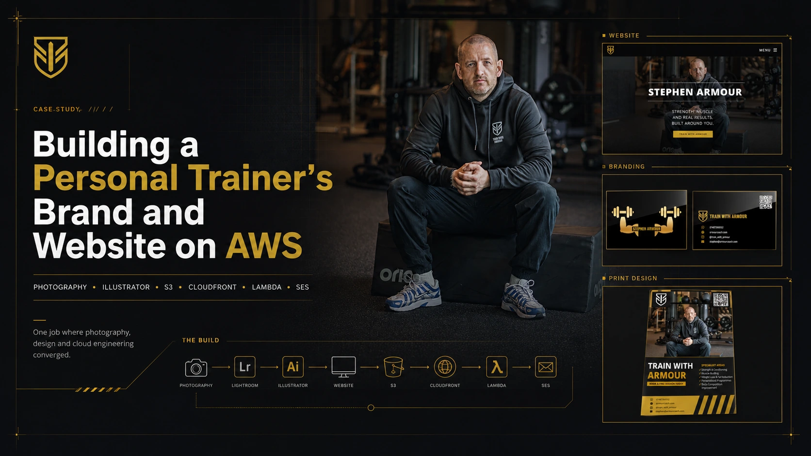
Building a Personal Trainer's Brand and Website on AWS: Photography, Illustrator, S3, CloudFront, Lambda and SES
How I built a complete brand for my first paying client, a personal trainer. Covers the photoshoot on a Sony A6700, photo editing in Lightroom, an A3 poster and business card in Illustrator, tracing a PNG logo into a clean SVG, choosing the domain, building and deploying the website on AWS S3 and CloudFront, a serverless contact form on API Gateway, Lambda and SES, setting up custom email, and the client handover. One job where photography, design and cloud engineering converged.
I’ve been training at the same gym for six months now. Over that time I’ve got to know the personal trainers, and they’ve seen me show up with my camera filming bits here and there. Stephen is one of those trainers. He takes his work seriously, and over the months we’d built up the kind of easy rapport you get with people you see every week.
This is the story of how a bad poster on his phone turned into my first proper paid client. I undercharged for the work, no question, but I was happy to help.
By the time I was done it had stopped being a poster. One thing led to the next, and the job ended up touching nearly every skill I’ve picked up over the years. Here’s the full list of what I delivered:
- A photoshoot, shot on my Sony A6700 with a new Sigma 56mm prime
- An edited hero image, processed in Lightroom
- An A3 print poster, built in Illustrator
- A brand name, chosen for a short, available .com
- A vectorised logo, traced from a PNG into a clean SVG
- A website at armourcoach.com, designed and reshaped from a template into his brand
- The cloud infrastructure behind it, his own AWS account, S3, CloudFront, Route 53, a custom domain
- A working contact form, serverless backend on API Gateway, Lambda and SES
- A custom email mailbox on his domain
- A print-ready business card, designed to match the brand
- A plain-language handover document so he can run it all himself
Photography, photo editing, graphic design, brand and domain strategy, raster-to-vector work, web development, cloud engineering, print design, and client documentation. A stack of separate disciplines, picked up over years for unrelated reasons, all landing on one job for one person. That convergence is the whole point of this post, so before the story, here’s the shape of it.
graph TD
    A["Stephen needs a poster"] --> B["Photoshoot · Sony A6700, Sigma 56mm"]
    B --> C["Photo edit · Lightroom"]
    C --> D["Poster · Illustrator, A3 print"]
    D --> E["Brand name · short, available .com"]
    E --> F["Logo · PNG traced to SVG"]
    F --> G["Website · HTML, CSS, Spectral"]
    G --> H["Cloud · S3, CloudFront, Route 53"]
    H --> I["Contact form · API Gateway, Lambda, SES"]
    I --> J["Email · custom domain mailbox"]
    J --> K["Business card · print design, black and gold"]
    K --> L["Handover doc · client owns it all"]
    L --> M["One brand · delivered end to end"]

    style A fill:#1a1a1a,stroke:#c9a227,color:#fff
    style B fill:#0d0d0d,stroke:#c9a227,color:#fff
    style C fill:#0d0d0d,stroke:#c9a227,color:#fff
    style D fill:#0d0d0d,stroke:#c9a227,color:#fff
    style E fill:#0d0d0d,stroke:#c9a227,color:#fff
    style F fill:#0d0d0d,stroke:#c9a227,color:#fff
    style G fill:#0d0d0d,stroke:#c9a227,color:#fff
    style H fill:#0d0d0d,stroke:#c9a227,color:#fff
    style I fill:#0d0d0d,stroke:#c9a227,color:#fff
    style J fill:#0d0d0d,stroke:#c9a227,color:#fff
    style K fill:#0d0d0d,stroke:#c9a227,color:#fff
    style L fill:#0d0d0d,stroke:#c9a227,color:#fff
    style M fill:#c9a227,stroke:#fff,color:#000
None of it was planned as a package. Each piece pulled the next one into existence. That’s how it actually went.
The Poster
Stephen came up to me one day and said he wanted to make a poster for himself. He pulled out his phone and showed me what he had. The image was low quality and pixelated, and the poster itself was just text on a black background.
 The poster Stephen showed me on his phone.
The only reason I can see that straight away is because I’ve been tinkering with this stuff since I first started learning cloud. Building websites, messing about in Illustrator, After Effects, all of it. I’ve got a creative side that I’ve been feeding for years. So when someone shows me a poster, I know almost instantly how it should look. Or at least I think I do.
I’d just bought the Sigma 56mm f/1.4 prime for about £350, for myself, because it was time to level up and I wanted a fast lens my kit lens couldn’t touch. At f/1.4 it throws the background into soft blur and isolates the subject, which is exactly what a portrait lens is for.
It was only later, talking to Stephen and looking at the photo on his poster, that it clicked. I told him I’d just got an amazing new portrait lens and that I should take some proper shots of him. He was up for it, so I brought the camera in the next day.
We met at 8:30 in the morning. This was the first time I’d ever done a photoshoot like this, but I knew where the light was, I knew how to position him, and I just snapped away. Natural light coming in from a window, Stephen seated on a bench I’d positioned, the gym blurred out behind him from the wide aperture. That f/1.4 does something to a background that a phone camera can’t touch.
I went home, pulled the hero shot into Lightroom, and the edit came out clean. He looked sharp, the light was doing the work, and the whole thing felt a tier above what he’d shown me the day before. It was a pretty good photo. I admired it myself, if I’m honest.
The original plan was just to give him the photo. Then I got carried away and thought, let me quickly make him a poster too. First time making a poster like that. I downloaded a template off Adobe Stock and spent an afternoon in Illustrator building it out properly. Set it up for A3 print so the quality would hold at size. Sent him the photos and the finished poster.
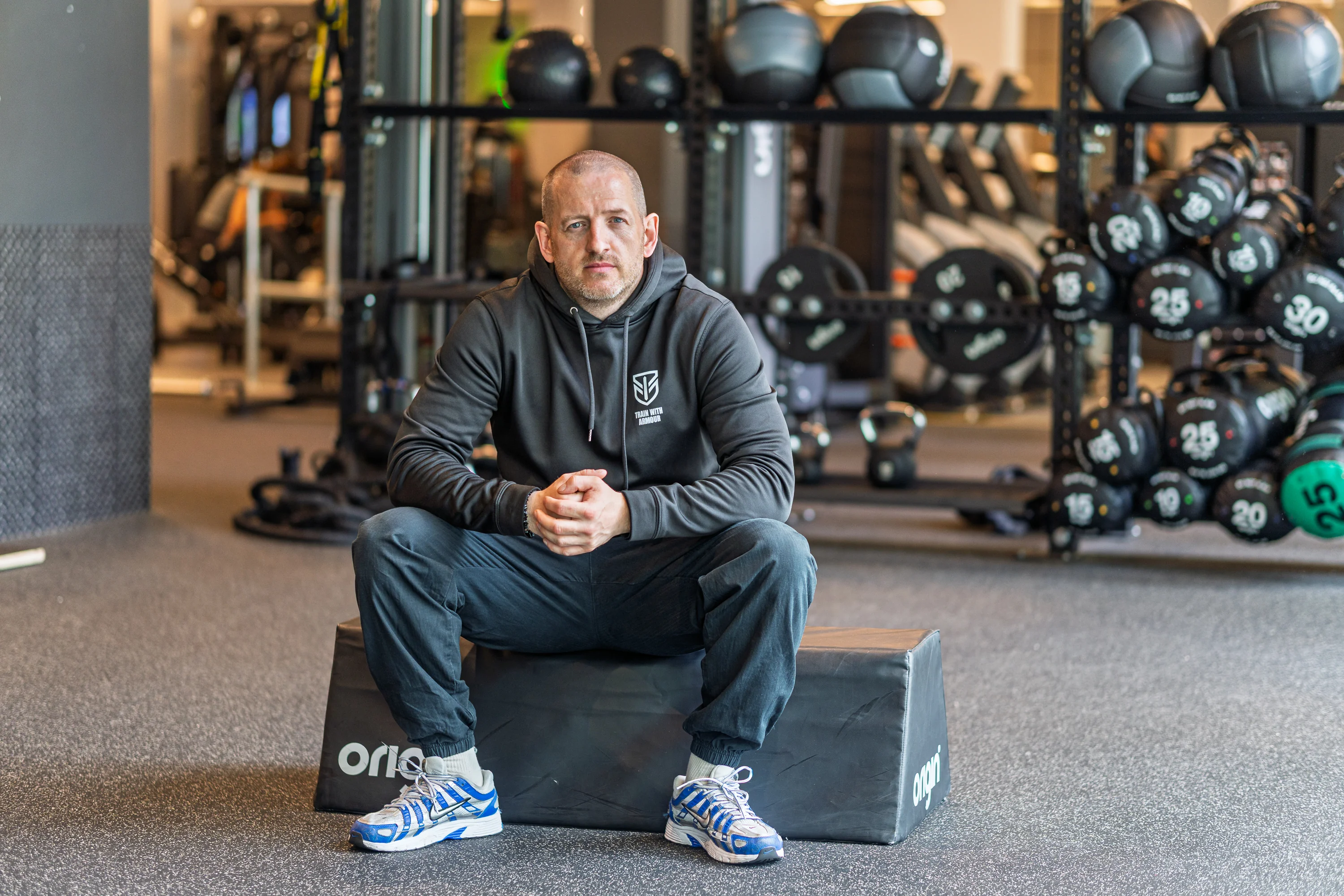 The hero shot. Natural light, f/1.4, gym blurred out behind him.
He loved it. Asked me how I knew how to do all of this. Other trainers saw it and were impressed too. People at the gym know I’m in tech, maybe a cloud engineer, but I don’t think they realised how far the skills actually go. I’ve been playing around and learning this stuff for years, and this was the first time any of them saw it land.
 The finished poster. Shot on the A6700, edited in Lightroom, built in Illustrator.
The Website
The following week Stephen came back. He’d seen another trainer’s website and wanted one of his own. He showed it to me.
I had a look and told him straight, it wasn’t very good. I’ve been tinkering with my own sites for years, and over that time I’ve worked out what I like, clean and minimal, nothing cluttered. I can’t always put words to it, but I get deep into where things should sit, how it should feel, all the finer UX stuff that most people never notice. So I told him I’d build him something better. Then I went further than that and said I’d host it for him on AWS too.
I’d done this before. When I built DenMotion I went through the whole process of naming a brand, checking domains, building the site, and deploying the infrastructure. DenMotion was the pinnacle of it, but before that I had digitalden.cloud, and even this site, denizyilmaz.cloud. So I knew the shape of what needed to happen.
First was the name. This is its own small skill, brand and domain strategy, and I approached it the same way I had for my own projects. I wanted something short, punchy, a .com, easy to type and easy to say. We checked a few on Route 53 to see what was actually available, because a name you can’t buy isn’t a name. Stephen couldn’t quite decide, so I made the call while building the site. armourcoach.com came out on top. Exact match, available, and “coach” sits a level above “personal trainer”. It says more about what he does. The other contender was armourbuild.com, but coach won it.
Setting Him Up Properly
Here’s where I made a decision that mattered. I could have hosted everything on my own AWS account and saved myself the setup. Instead I created him his own account.
I set him up as the root user, tucked those credentials away safely, and created an IAM user for myself so I could build without touching his root login. Set a billing budget so nothing runs away. He also picked up the new account credits, which covers the small costs for months, though for a single static site on Route 53 the running cost is pennies anyway.
The reason I did it this way is ownership. It’s his business, so it should be his infrastructure. If he ever wants to take it elsewhere or bring in someone else, it’s all his. I’m building on his account, not holding his website hostage on mine. I don’t think most people building websites bother with this. After all, I’m a cloud engineer, so I wanted to do it the right way, give him long-term savings, and honestly the whole thing is fun for me anyway.
The Build
I built it on an HTML5 UP template called Spectral. The obvious question people ask now is why not just get an AI to spin up a website in minutes. Here’s the reasoning.
I’ve worked with HTML5 UP templates extensively. They’re clean, no bugs, and they work exactly as intended. AI has this habit of bolting changes onto the end of the code and adding unnecessary long lines, where with a proper template I can go straight in, make the change I want, and keep the code lean. I like lean code. A proven template I can edit cleanly beats generated mush that falls apart the moment you resize the window.
The colour was the first big decision. Black and gold. A near-black base with a muted gold accent, the same gold pulled from his poster, so the website and the print material feel like one brand. Black and gold looks sleek, it reads premium, and it suits a trainer who takes himself seriously. The whole thing leans cinematic rather than the bright, busy look most trainer sites end up with.
From there it was a full reshape of the template. Spectral ships as a light, corporate, teal site, so turning it into something dark and cinematic meant overriding a lot of what it wanted to be. Every section background went near-black. The teal accent got swapped for gold across buttons, icons, form fields, and the header. The text colours all had to be reworked so they read on a dark background instead of a light one.
The hero is full-screen, one of the shots from our 8:30am session sitting behind his name with a dark gradient over it so the text stays readable. Below that, a section laying out what he does, the photos doing the selling through edge-to-edge image bands, a testimonials section, and a packages section.
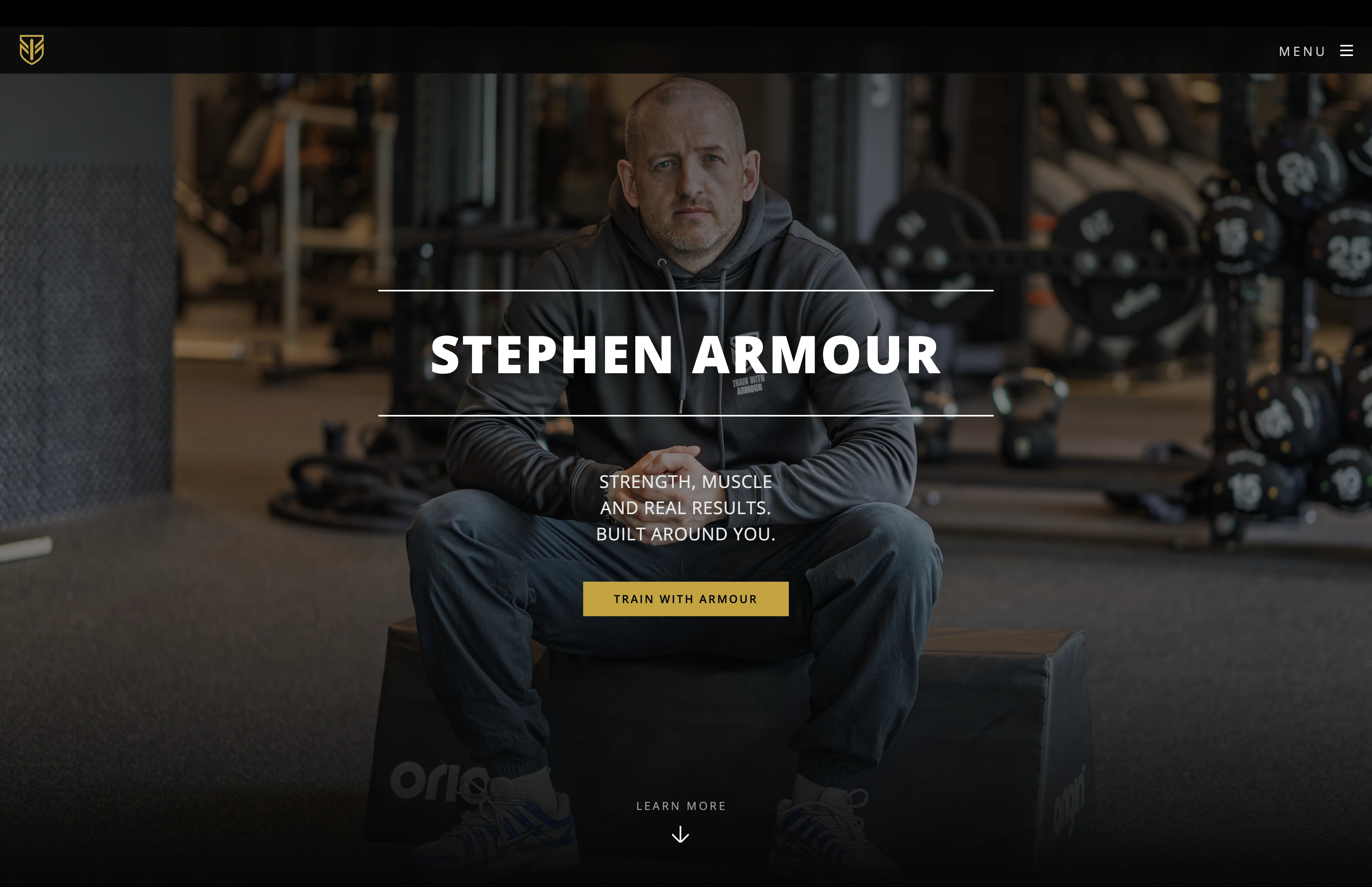 The hero. That 8:30am shot behind his name, dark gradient over the top so the text reads.
I added a few touches that lift it above a stock template. The brand logo sits top-left on the hero and the name appears next to it once you scroll. Sections fade up gently as you scroll into them, which makes the whole page feel considered rather than dumped on screen. The contact section splits into the form on one side and direct contact options on the other, with the phone, WhatsApp, and Instagram all there.
Here’s the part people underestimate. Stephen gave me nothing to work with. No copy, no bio, no descriptions of what he offers, no reviews. Just a name and a willingness to train people. So I wrote all of it. Every line on the site is mine, the headline, the what-I-do descriptions, the package explanations, the calls to action, all written to sound like a trainer who knows what he’s doing and takes it seriously. I wrote the testimonials too, as placeholders in the right voice, sitting in the layout so the section reads and looks correct rather than sitting empty, ready to swap for real client quotes once he gathers them. A site with no words is just a layout. Filling it with copy that actually sells him, from a blank page, is as much of the job as the code.
For the packages I built a comparison table showing what’s included in each tier, but with no prices on it. Putting numbers up lets every other trainer in the gym see exactly what he charges and boxes him into one figure. Better to show the value, drive people to enquire, and let him have the pricing conversation himself.
The work itself went the way these builds go. Some of it smooth, some of it a fight. The fiddly part is always that bending a template into a look it wasn’t designed for means fighting its defaults, and CSS has a way of making you chase one stubborn override for far longer than it should. The lesson I keep relearning is that the template you start with is the biggest decision you make. Pick one that already looks how you want, and the rest is easy. The flip side is that I now have a dark, cinematic build I can reuse, so the next trainer site is mostly swapping content and colours.
The whole thing runs on his AWS account. The static files live in an S3 bucket, CloudFront serves them from edge locations so it loads fast and over HTTPS, and the deploy is a sync to S3 followed by a cache invalidation. The same serverless setup I use for my own sites.
The Logo
Stephen had a logo already, a shield mark, but only as a PNG. A raster file like that is fine for a thumbnail and useless for anything else. Scale it up for the hero, the favicon, the footer, or the business card and it goes blurry and pixelated, because a PNG is just a grid of pixels with no idea how to redraw itself bigger.
So I vectorised it. I traced the PNG in Illustrator and rebuilt it as an SVG, a high-quality vector file that’s defined by maths rather than pixels. That means it stays razor sharp at any size, from a 16px browser tab favicon to a printed card to a full-screen header, all from one file. I cleaned up the edges in the trace so the shield came out crisp, then used that single high-quality SVG everywhere the logo appears across the site and the print work.
It’s a small thing that makes everything downstream possible. The crisp logo on the business card, the favicon in the browser tab, the mark on the hero, all of it comes from that one vectorised file. Without it, every use would have been a compromise on a blurry PNG.
What I Can Actually Do
The thing that strikes me looking back is that none of this was planned. I didn’t set out to start a side business. I bought a camera to improve my AWS demos, learned photography because I had the camera, learned video because I had the photography, and learned the cloud and web stuff years ago for a completely different reason. Stephen needed a poster, and suddenly all of it had a use.
That’s the same pattern I wrote about with DenMotion. Skills you pick up separately, for unrelated reasons, start overlapping in ways you couldn’t have planned.
graph TD
    A["Stephen needs<br/>a poster and a site"] --> B["Photography<br/>Sony A6700, Sigma 56mm"]
    A --> C["Photo editing<br/>Lightroom"]
    A --> D["Design<br/>Illustrator, After Effects"]
    A --> E["Web build<br/>HTML, CSS, templates"]
    A --> F["Cloud<br/>AWS, S3, CloudFront, Route 53"]

    B --> G["One person<br/>delivers all of it"]
    C --> G
    D --> G
    E --> G
    F --> G

    style A fill:#1a1a1a,stroke:#c9a227,color:#fff
    style B fill:#0d0d0d,stroke:#c9a227,color:#fff
    style C fill:#0d0d0d,stroke:#c9a227,color:#fff
    style D fill:#0d0d0d,stroke:#c9a227,color:#fff
    style E fill:#0d0d0d,stroke:#c9a227,color:#fff
    style F fill:#0d0d0d,stroke:#c9a227,color:#fff
    style G fill:#c9a227,stroke:#fff,color:#000
A trainer needs a poster, and it turns out you can shoot, edit, design, build, and deploy. Most people can do one of those. The intersection is where the value sits, and that intersection is almost empty. Cloud engineers don’t usually shoot video. Photographers don’t usually configure CloudFront. I happen to do both.
The Price
This is the part I actually had to think about.
Stephen is my first client like this. He’d already been impressed by the photos and the poster, he had faith in my skills, and he told me he’d pay whatever. Which is exactly the situation where it’s easy to either undercharge out of guilt or overcharge because you can.
I wanted to give him a good price because I wanted to help him out. He’s a good lad and he’s the first person to trust me with this. At the same time I’m putting real hours in and I want to make something from it. So I went with mate’s rates. Low enough that he knows he’s being looked after, not so low that the work feels worthless.
When I told him, I framed it as a heads up rather than a quote. Said the time I’d been putting in, here’s roughly where it lands, and I’m sure you’ll be impressed when you see it. His reply was the bit that stuck with me. He said it wasn’t a surprise at all, that he was well aware I was doing him a massive favour, and that it was much appreciated. Offered to pay cash or card, whatever suited me, and said he’d have brought cash in that day if he’d known.
No haggling. No hesitation. Just gratitude and ready to pay. That’s the whole thing about doing the work first and letting it speak. By the time you name a price, they’ve already decided they want it.
What I Learned
Going low for a first client buys goodwill, and goodwill brings referrals, which is worth more than the difference between one number and another. Whatever I charge Stephen becomes the number he repeats to the next trainer he sends my way, so mate’s rates today set the floor for tomorrow. Worth knowing, not worth losing sleep over.
At the end of the day Stephen is also trying to make money in the gym, building his own client base, same as me. I’m not greedy, and I’m happy to help someone who’s grafting for it. I enjoyed all of this anyway. I see it as art more than work, and the money is almost a side effect of doing something I’d be doing regardless.
Taking It Live
Stephen had a look at the CloudFront link, he was happy, so I finished the job. Here’s what that involved.
First the account itself. His AWS account was still on the Free Tier, which blocks domain registration, so I took it off that using his root login. Then I registered armourcoach.com through Route 53, in his account, not mine.
Pointing the domain at the site was the next piece. CloudFront needs a TLS certificate to serve a custom domain, and the certificate has to live in us-east-1 regardless of where everything else sits, because that’s the only region CloudFront reads certificates from. I requested a wildcard certificate covering armourcoach.com and everything under it, validated it through DNS, and because the domain was already in Route 53 in the same account the validation records went in automatically. From there it was adding the domain to the distribution and pointing alias records at CloudFront for both the apex and the www version. A few minutes of propagation and the site was live on its proper name, over HTTPS, both armourcoach.com and www.armourcoach.com.
The Contact Form
Then the contact form, which was the real build. A static site can’t send email on its own, so the form needs a backend. The pattern is the same one I run on my own sites. The form posts to an API Gateway endpoint, which triggers a Lambda function, which sends the email through SES. When someone fills it in, Stephen gets a notification with their details, and the sender gets an automated reply confirming the message landed.
I tightened a few things over the version I first wrote for myself. The cross-origin rules are locked to his domain only, so nothing else can post to the endpoint. There’s input validation on the fields and a hidden honeypot field that spam bots fill in and humans never see, which drops junk submissions without needing a captcha. The whole thing runs on his account on a least-privilege role that can do nothing except send email and write logs. I also dropped a feature I had on my own version, an AI-generated quote in the reply, because on a paying client’s professional site it added cost and a second thing to break for no real benefit. Lean is better.
graph LR
    A["Visitor fills<br/>contact form"] --> B["API Gateway<br/>HTTP API, POST"]
    B --> C["Lambda<br/>validate, honeypot check"]
    C --> D["SES"]
    D --> E["Notification<br/>to Stephen"]
    D --> F["Confirmation<br/>to visitor"]

    style A fill:#1a1a1a,stroke:#c9a227,color:#fff
    style B fill:#0d0d0d,stroke:#c9a227,color:#fff
    style C fill:#0d0d0d,stroke:#c9a227,color:#fff
    style D fill:#0d0d0d,stroke:#c9a227,color:#fff
    style E fill:#c9a227,stroke:#fff,color:#000
    style F fill:#c9a227,stroke:#fff,color:#000
SES starts every new account in a sandbox that only sends to verified addresses. Fine for testing, useless for a public form. So I requested production access, explained the use case in detail, low volume, transactional only, no marketing or mailing lists, and once AWS granted it I tested the full path end to end. It’s live now. A real submission lands in Stephen’s inbox, and the visitor gets their confirmation reply, no verified address needed. The reply is branded, signed off with his name and the slogan that runs through the whole identity, “Strength, muscle and real results. Built around you.”
The Email
A contact form that sends mail is one thing, but Stephen also needed a real mailbox on his own domain. An email address like stephen@armourcoach.com does two jobs. Enquiries go somewhere he actually reads, and his replies look professional coming from his own brand rather than a personal address.
I set the mailbox up on Zoho’s free tier and configured the DNS so the mailbox records sit alongside the SES records on the same domain. This is the part that quietly breaks email if you rush it. SES and the mailbox have to coexist without stepping on each other, one sends the automated form mail, the other is where Stephen reads and replies. That means getting the MX, SPF, and DKIM records right so both are authorised to act on the domain without one overwriting the other. Done carefully, it just works, and he has a clean professional inbox on his own name.
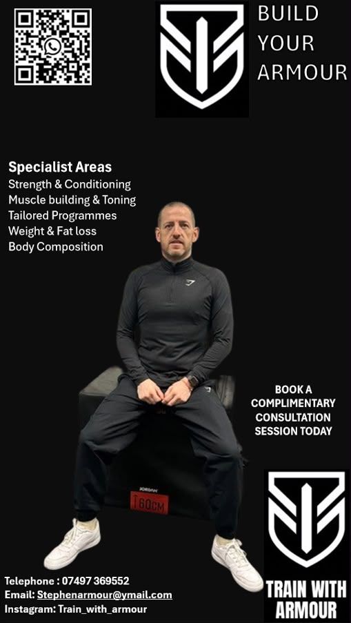
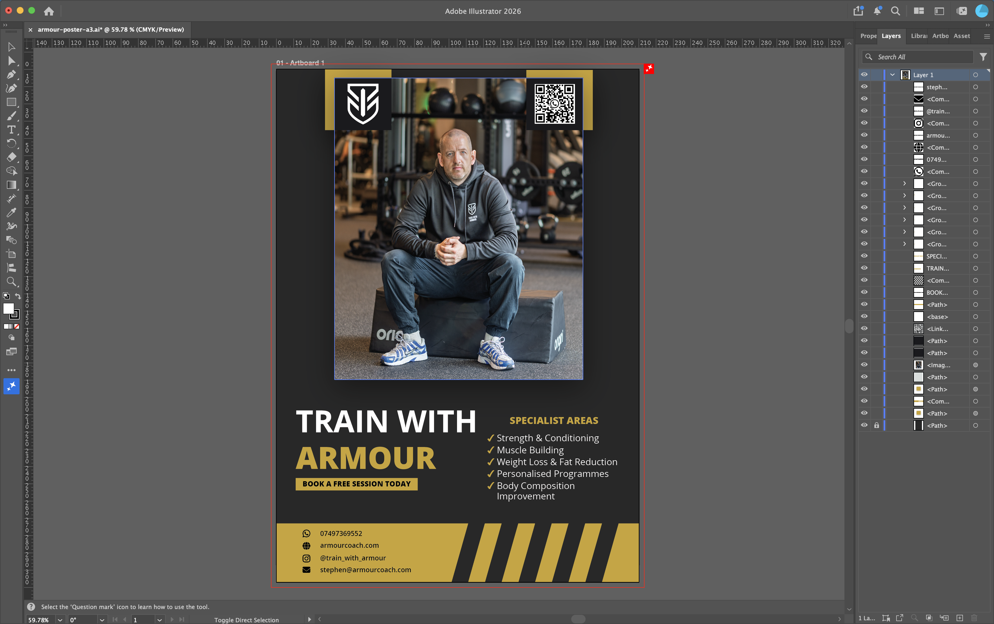
The Business Card
With the brand established, the obvious next thing was something physical he could hand out. A business card, in the same black and gold as the poster, the site, and the email sign-off, so every touchpoint feels like one business.
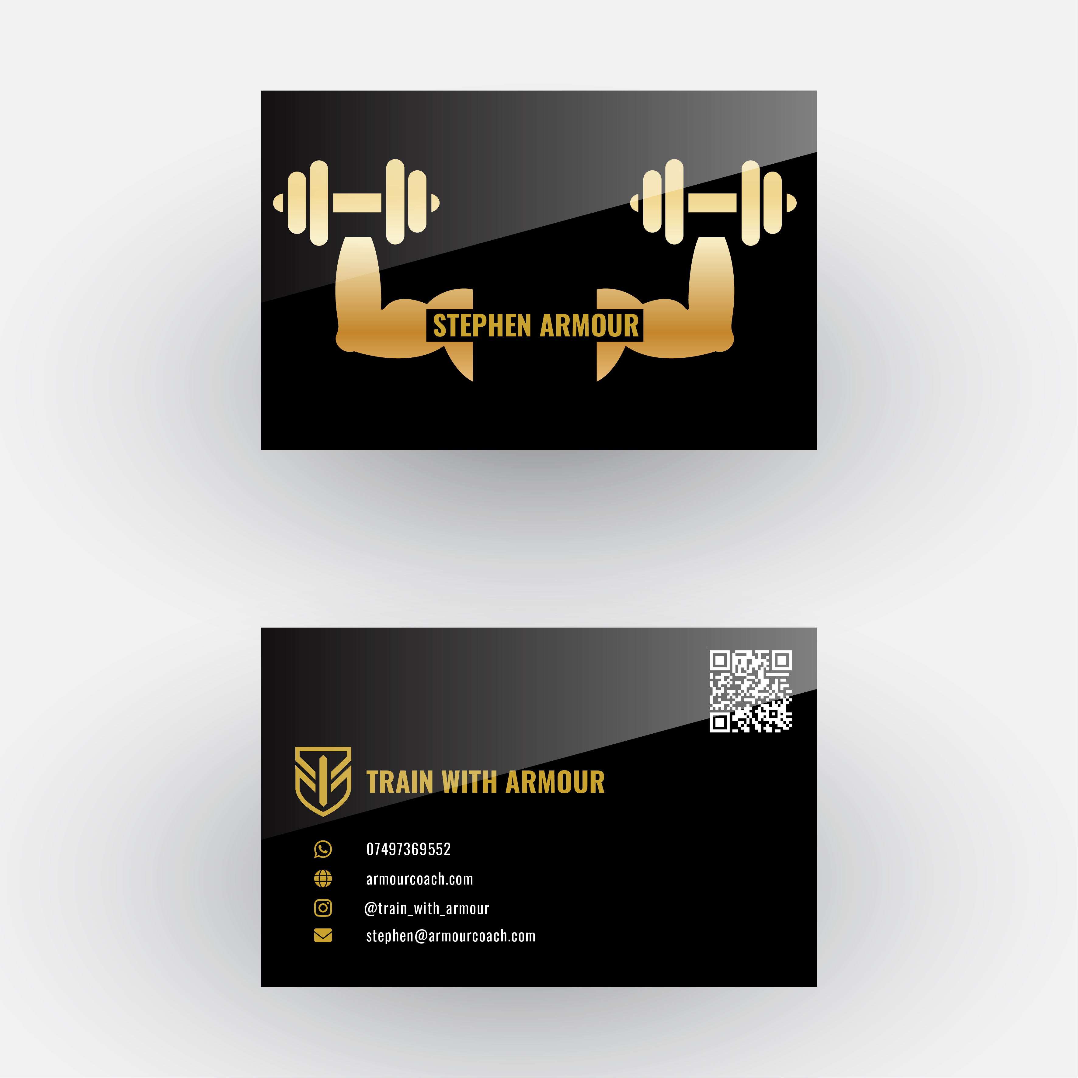 The business card. Front carries his name and the dumbbell mark, back carries the shield, contact details, and a QR code to the site.
I built it in Illustrator at proper print spec. Standard 85 by 55mm, 3mm bleed on every edge so the background runs off the cut line and never leaves a white sliver, CMYK colour mode because print is not RGB, and the gold converted to a print value rather than the screen hex. The front carries his name and the dumbbell graphic, the back carries the shield logo, the contact details, and a QR code that points straight to armourcoach.com.
The details on the back use the same icon set as the website’s contact section, the same Font Awesome glyphs, recoloured to the brand gold, so the card and the site speak the same visual language. WhatsApp, phone, Instagram, and email, each on its own line, aligned and evenly spaced. The text sits in white against the black so it reads cleanly, with gold kept for the brand marks and icons rather than smothering everything in it. Gold as an accent reads premium. Gold on everything reads cheap.
Before it goes to print the fonts get outlined so the printer does not need them installed, everything gets flattened, and the whole thing exports as a press-ready PDF with crop marks and bleed. I also stacked the two sides into a single vertical image so Stephen can share the card on his Instagram, not just print it.
That is the brand closing the loop. It started as a pixelated poster on a phone and ended as a consistent identity running across photography, print, web, email, and a card you can hold.
The Handover
The last thing I did wasn’t code or design. I wrote Stephen a handover document.
Everything I built runs on his own accounts, in his name, so he owns all of it and isn’t tied to me. The flip side of that is he now has accounts and services he didn’t have before and doesn’t fully understand yet. A handover doc fixes that. I wrote him a plain-language README covering what he has, where each piece lives, his account logins, what every part does, what he might need to do, the running costs, and who to contact. No jargon, written for him, not for an engineer.
It matters for two reasons. It means he can actually use what I built without coming back to me for every small thing, and it means if he ever brings in another developer the whole setup can be handed over cleanly. Building something for a client and leaving them with no idea how it works isn’t finishing the job. The documentation is part of the deliverable.
Wrapping Up
The site is live on its own domain at armourcoach.com, the contact form works end to end, the email lands, and the brand is fully delivered. Stephen received his first real enquiry through the form while I was still testing it. The template licence is bought so the footer credit is gone, and everything sits in his own accounts with a plain-language guide so he can run it himself.
So the final tally. A photoshoot, an edited hero image, an A3 poster, a brand name, a vectorised logo, a website, the cloud infrastructure behind it, a working contact form, a custom mailbox, a business card, and a handover document. All on his own accounts, all carrying the same black and gold identity. From a pixelated poster on a phone screen to a full brand running across photography, print, web, email, and infrastructure, in the space of a few weeks. Not a bad first one.